I've recently been either blessed or cursed to work on a number of websites that make use of the PNG file format. They're small, they look great, and they support full transparency with variable opacity. Problem is: Not all browsers support them.
For those not familiar with this type of image, The Portable Network Graphic (PNG) image format was developed in the 1990s by the World Wide Web Consortium in response to Unisys's plans to exercise its intellectual-property rights over the GIF format. The intent was to develop a "better GIF than GIF" that would use alpha channels to give designers and developers true transparency – drop shadows on any background, translucent images, and anti-aliased edges.
While Netscape and Mozilla browsers long displayed PNGs in their full glory, the format hasn't been a runaway success in large part because Internet Explorer doesn't always handle PNG graphics correctly. IE support for PNG transparency – perhaps its greatest advantage over GIF – has been very limited, typically rendering the transparent parts opaque. Javascript work-arounds have been available to let designers and developers "hack" IE, but until the 2006 release of IE 7, Microsoft browsers could not be relied upon to accurately display PNG graphics. At that time, nearly 66% of users browsed using IE 6 or IE 5, neither of which correctly displayed PNG images.
But it's now 2008 and IE 7, the last major browser to support PNG graphics, has been on the market for almost two years. Is it safe at last to use PNG images to cast shadows and smooth edges?
The answer is an enthusiastic, "Sorta."
From January 2006 through November 2007, use of IE6 and IE5 fell from 65.8% of the surfing public to 35.2% while PNG-friendly IE7 rose to a 21% saturation. So clearly IE7 has yet to supplant it antiquated predecessors. That would be the end of the story were it not for the parallel rise of Firefox over the same time period from a 25% share to a 36.3% share of the surfing public. Indeed, as of this writing, Firefox is the most popular single browser in use online, beating out IE6 by 2.7%. (source: w3schools.com)
The result of all this jockeying of browsers is that, as of November of 2007, PNG-friendly browsers (Firefox, IE7, Mozilla, Safari, and Opera) have collectively supplanted unfriendly browsers (IE6 and IE5) by 57% to 35%.
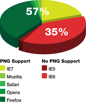
So much like our previous findings about the trend away fro 800x600 as the default page dimension, we find that a conditional answer must suffice (if not satisfy). The answer depends on the intended audience and the designer's concern for the shrinking population of incompatable users.
For our part, we're embracing the PNG format for some projects and not others. For projects targeting tech-savvy customers – those most likely to either use a Mozilla-based browser or to have upgraded their own work machine to IE7 – we're diving in with PNG and never looking back. For more mass-market projects were either avoiding PNGs or hacking our way around them. Either way, widespread support for the PNG file format is here, it is growing, and it gives designers greater flexibility – all conditions that will no doubt encourage the format's utility online. FB
Friday, December 28, 2007
Wednesday, December 26, 2007
Translation, the Google way (La traduction, la manière de Google)
(originally posted on PoorMartin.com) Taking a break from all this baby talk to mention something else that really interests me...
There are a number of great translation websites that can help you speak exotic languages. Perhaps you've used online translators like Babelfish (a fantastic, and functional, homage to Douglas Adams' useful little ear swimmers) or Systranet. Maybe you've even plugged FoxLingo into your browser of choice.
The problem with all of these tools is, of course, that they require you to open up a web browser and, tediously, type in a URL or click on a bookmark. If only, the lazier among us ask, there was a way to translate my clever quips into foreign tongues without even leaving my IM client.
Behold!
Google has integrated its Google Translate tool into its Google Talk and GChat interfaces through the use of chat bots. Now, if you have a Google Talk account, you can use your IM client (such as iChat, Adium, or Pidgin) as an interpreter in your group chat, or as a pocket translator in your Google Talk client for a BlackBerry.
For example, to have a line translated from English to French, invite en2fr@bot.talk.google.com into a chat session. Then simply chat the line you want to see translated and the correct translations will come back to you. Comme ça!
For other languages, just chat-up any of the 23 other translation bots. They're named using ISO two-letter language abbreviations. Indeed, one of the strongest points the Google Talk translations offers is its support for non-Latin alphabet languages, such as Arabic or Chinese. Just add en2zh@bot.talk.google.com as a friend in Google Talk and send it a message to translate from English to Chinese. The bots even translate from several languages into English. For example, to translate from Arabic to English, talk to ar2en@bot.talk.google.com. You can even translate between foreign tongues, such as from French to German, by chatting with fr2de@bot.talk.google.com.
Of course, these are computer translators – no excuse for real human linguists who understand pesky little details like jargon and context. In my experience, computer-aided translation works best if you write your English text in a format resembling the grammar of the target language – taking into account, for instance, Romance languages' reversal of the adjective-noun relationship or Arabic's unique treatment of the definite article and the "to be" verb. And a basic understanding of the foreign language – verb tense in particular – is necessary to troubleshoot the results and polish the foreign text to match your English meaning.
At first, I couldn't believe it worked. But now I'm loving the Google Talk translator. I now have two new "buddies" who speak strange and exotic tongues to me, who never send me an embarrassing chat while a client is standing at my desk, and who always help me sound smart. FB
Thursday, December 20, 2007
Zeitgeist
It's that time of year again. In addition to the usual litany of New Years retrospectives, Google has released its annual report (of sorts) on the way we search. The 2007 Zeitgeist – a German word they've borrowed to describe "the spirit of time", the general intellectual, moral, and cultural climate of an era. At least that corner of the era we find through Google.
Google measures our search trends on a much more regular basis than once a year. Monthly international Zeitgeists and Google's new Current query reporter seek to capture our collective interests in much more intricate detail. But the annual Zeitgeist does an excellent job of both packaging our searching trends into a easily discernible graphic medium and of reminding us what our fleeting interests were over the last twelve months.
Newsworthy events dominated the trends. The deaths of Anna Nicole Smith and Pavarotti, the Virginia Tech shooting, and the Don Imus affair peak alongside searches for High School Musical 2's Vanessa Hudgens and Radiohead's pay-what-you-want release, In Rainbows. The Zeitgeist also breaks down our search trends by theme, looking at our leading searches alongside newsmakers, showbiz, the "next big thing," and the heavier age-old questions.
As a historian, I am dumbstruck by the cultural historical utility this sort of report provides future researchers. As a professional creative, I am equally struck by the simplicity of the data display (even if I am disappointed by the vagueness of Google's quantifications – Y-coordinate values are absent from the whole Zeitgeist.) I am likewise glad to see the Zeitgeist's graphic and information design advance from its more primitive (but no less informative) beginnings.
According to Google, the annual Zeitgeist is not simply a list of the most frequently-searched terms for the period – terms that don't change much from year to year. Such a list would be dominated by generic searches, such as "ebay", "dictionary", "yellow pages," "games," "maps," and, of course, a number of X-rated keywords. Instead, the Zeitgeist describes searches that were very popular this year but not last year – the explosive queries and topics that everyone obsessed over. Thus, a year's most popular searches are ranked based on how much their popularity increased compared to the year before. Similarly, Google's "what is" and "who is" lists are not necessarily the absolute most frequent searches, but rather those that best represent the passing year.
The result is a fascinating glimpse at what fascinated us in 2007. The archive is worth pouring over as well, whether to view years or months past. Buried throughout are wonderful nuggets of cultural history, such as a Zeitgeist retrospective on September 11, 2001 search trends, and embarrassing realities, such as Britney Spears' and Paris Hilton's dominance of the celebrity search.
Enjoy the look back. FB
Tuesday, November 6, 2007
Designer Diversions with Substance
We recently stumbled across two entertaining diversions that screamed to be shared:
Make My Logo Bigger Cream
For every designer that has struggled against clients who hate white space, swoon for starbursts, and love big, fluorescent logos, the satirical infomercial for Make My Logo Bigger Cream (and its associated products) will ring painfully true.
We found that every designer and developer who saw this ad found a different product most appropriate for their client or boss – from the Whitespace remover spray to the emotional lotion. By our count, the only "solution" Make My Logo Bigger Cream's creators forgot was a "set my logo on fire" starter log.
If Microsoft Designed iPod Packaging
A relic from 2005's iPod introduction and related hoopla, this video pokes clever fun at the different aesthetics Apple and Microsoft bring to product packaging. The result is so dead on that you can almost imagine the butchered Microsoft iPod 2005 (Human Ear Edition) packaging sitting on the shelf next to an abandoned copy of Vista.
The video's use of music and client direction and comments is phenomenal. You can actually watch the design transform from Apple's polished packaging into it Microsoftinstein antithesis.
Microsoft iPod
Wednesday, October 17, 2007
Follow the Bouncing Balls (and Bunnies)
Fresh on the heels of bouncing balls in San Francisco and a tower of paint in Glasgow, bunnies are taking to the streets of Manhattan. 200 plasticine bunnies, to be exact – hopping around the city, leading us toward a huge 30-foot bunny looming over Thomas Paine Park in Lower Manhattan.
This television advertisement, titled "Play-doh," was released earlier this month by Fallon London. It is the latest in their ambitious advertising campaign for Sony Bravia. And, like nearly all things we review on Fight.Boredom, it's fun, well-executed, and inspiring.
"Play-doh" follows in the footsteps of the mesmerizing "Balls" and the explosive "Paint" adverts, all using the same stop-and-go claymation technique popularized by Wallace and Gromit and Robot Chicken.
Sony Bravia "Play-doh"
Backing the "Colour like no other" tagline of Sony's campaign to push Bravia high-definition LCD TVs, "Play-doh" features rabbits ranging from 10cm to 10m in height. A team of 40 animators spent three weeks choreographing the models to create the 100,000 still images required to produce the 60-second ad. They also used 150 1ft cubes, created a 200 square foot purple plasticine crashing wave and made a whale "swim" through the streets of Manhattan. Ultimately, the ad required animators to manipulate 2.5 tons of plasticine – all while locals went about their daily lives in and around the elaborate sets.
"Technically this is the most difficult thing I have ever done," said the ad's director, Frank Budgen. "It is an incredibly difficult situation to control. You have New Yorkers wandering through frames and you have no say over it because we're doing it for real."
If this effort sounds impressive (as it should) consider the work required to execute the previous ads in the Bravia campaign. For the pilot ad, "Balls," artists released 250,000 bouncing balls on San Francisco.
Sony Bravia "Balls"
And for its follow up, "Paint," artists created an elaborate pyrotechnical paint display in Glasgow that required 70,000 liters (18,500 US gallons) of paint, 1,700 detonators, 455 mortars, 622 bottle bombs, 65 camera positions and a crew of 200 people to capture a kaleidoscope of paint exploding on a disused council block in Glasgow.
Sony Bravia "Paint"
But the newest edition to the Bravia campaign has attracted a fair share of critics. Observers have pointed out a distinct conceptual similarity between "Play-doh" and a panorama illustration by Los Angeles-based art duo Kozyndan.
But regardless of "Play-doh"'s imitation, coincidental similarity, or outright theft, the ad remains a masterpiece of execution of scope. In an era when the vast majority of animated "real-world" advertisements rely on CGI, Fallon London's refreshing low-tech animation is a delight to behold.
Monday, October 15, 2007
It's The Most Marketed Time of the Year
If you thought that it was too soon to plan for Christmas... well, the folks at Home Depot aren't the only ones who think you're wrong. Already this season's holiday promotions and interactive cards – combined with fresh reminders of past years' best leftovers – are popping up online and in your email box.
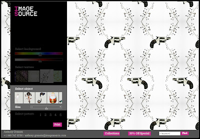
We wanted to take a moment to acknowledge one of this year's early arrivals and rapid stand-out favorites: ImageSource's Open Your Eyes wrapping paper generator – a great little way to fight the gift-giving season's barrage of tired and garish paper choices. The stock photo company has provided a collection of iconic photographic images, isolated to work against a variety of background images or against the whole spectrum of background colors. As many as three elements (from a collection of dozens) of any user-defined size can be arranged in five patterns. The results are highly original and personal designs. Our favorites? The shroom/elephant and floral/handgun (see above) combos.
Give Open Your Eyes a whirl. The result may not be festive, but the tool sure is fun to play with. And the results – be they tacky or ... less tacky – are sure to pop under the tree. Let us know what you come up with.
Thursday, October 11, 2007
Believe
For the last several weeks Microsoft has inundated us with a marketing assault on behalf of the Xbox’s premier video game title, Bungie studio’s Halo 3. Thankfully, this campaign revolves around an original and well-executed concept.
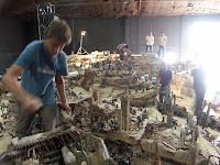
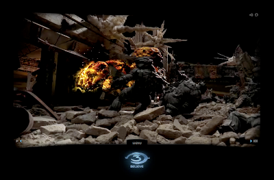
Halo 3’s mix-media campaign, “Diorama,” features a fictional monument created in the year 2607 to pay tribute to Halo’s great hero, Master Chief Petty Officer John-117. The concept is drawn from the same sort of evocative documentaries that have been made about real wars. But the real footage of this fictitious monument is drawn from a model-maker’s dream – 12-foot-tall, 1200-square-foot diorama peopled with painstakingly handcrafted 8 to 19-inch hand-crafted figures, billows of smoke erupting from a cannon, aircraft, and tanks; luminous explosions, and intricate details ranging from the sweat dripping down a Marine’s brow to bodies in mid flight through the air.
On television, Halo 3’s diorama spots (see below) feature slow vignettes from the vast, violent model, set against a symphonic score. The result is a composition as refreshing as Microsoft’s earlier Gears of War “Mad World” television campaign (see below) – indeed, reminiscent of Akira Kurosawa’s beautifully scored battle in Ran (see below). But combined with Halo 3’s online marketing, the diorama enjoys a much more impressive scope both in terms of concept and execution.
Halo 3’s Believe website features a stunning interactive view of the John-117 Monument. The Believe website allows you to “fly through” the action, see all the models, take a look at the buildings and all the detail involved, enjoy 360 views, and explore the different characters and creatures memorialized. But perhaps the most inventive aspects of your journey though the monument are the fictitious “first person accounts” of the battle and well-produced videos of 27th century war veterans touring the fictional Museum of Humanity, providing oral histories of the Master Chief’s – and humanity’s – final battle against the Covenant. The result is an engaging fictional history well timed in its juxtaposition with Ken Burns’ The War.
The diorama has proven so popular, both online and on television, that it is currently being taken apart with plans to have it tour the country, stopping at Halo events and maybe even a few museums.
Building on the popularity of the diorama’s television and online media, Microsoft and Bungie also released a making of documentary that showcases the very real work, effort, and time that was put into making the diorama. But in keeping with the rest of the campaign, even this making of documentary assumes the narrative view, explaining that the John-117 Monument was created over the course of three years as a memorial to the New Mombasa battle and its hero Master Chief. It shows how the “historians” accurately sculpted each figure using UNSC face scanning records, how they modeled Covenant figures after bodies recovered from the battlefield, and how they sculpted the terrain using blue prints of the area.
About whether or not the diorama spoils the much anticipated conclusion to the Halo trilogy, Bungie’s Frank O’Connor said that the ads were created by a marketing team who had no idea how the game ends and that it is not meant to be part of the game’s canon. Instead the ads, specifically that 1200-square-foot diorama created for them, is meant to be a generic representation of a series of battles, perhaps a level in Halo 3.
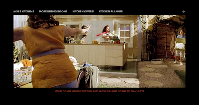
The diorama’s Flash-based fly-through makes great use of both user interaction and positioned content within the model. When we first visited the site, we were instantly surprised by its similarity to Ikea’s Dream Kitchen microsites – one of the most heavily awarded interactive franchises.
The firm behind Ikea’s interactive dream kitchen, Forsman & Bodenfors, has garnered nearly every creative award available for two prior efforts for Ikea, “Dream Kitchens for Everyone” and “Come Into the Closet.” It’s latest incarnation of the Dream Kitchen franchise offers a first-person, self-paced view of Ikea furnishings and kaleidoscopic run-throughs of well-priced Ikea kitchenware.
According to Forsman & Bodenfors’ web director Mathias Appelblad, Ikea’s fly-thoughs “consists of ridiculously many sequences stitched together into a seamless journey. All exterior shots were filmed in South Africa … Interior sets were built in a studio and shot with a computer controlled motion control rig called a Milo. The Milo is the size of a small car and runs on rails, which gets a bit tricky when you need to have kitchens, dining areas and frozen people in a set with 360° views. So the sets had to be built lego style, with different parts being removable to make space for the Milo, and different parts of each set had to be filmed in unnumbered passes, to be assembled to one perfect shot in the end. And all that in two directions, with multiple turning points.”
Both the Halo 3 and Ikea Dream Kitchen online fly-throughs do superb jobs bringing the user into their respective environments. Certainly, one campaign has done its part to make this die-hard Apple user break down and want a Microsoft product (a paradox offset by Bungie’s history as a Mac game developer). The other has pointed out just how unglamorous my kitchen is (even when I close one eye and “fly-through” it on my way to the Cheerios).
Halo 3 Diorama Television Spot
Gears of War Mad World Television Spot
Akria Kurosawa's Ran, Clip
Saturday, September 29, 2007
Killer Kulers
Struggling to design appealing and effective color palettes can be one of the most difficult challenges a graphic designer faces in the course of developing a project. When existing collateral or brand systems leave palette options wide open, it is often challenging to get started with meaningful color exploration.
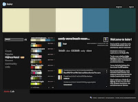
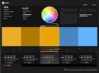
Thankfully Adobe Labs has stepped up to the challenge. They recently introduced Kuler, an online application that helps designers create 5-swatch color systems based on a variety of mathematic rules.
Starting with a single primary color – easily derived or established by even the most remedial comp – Kuler's seven rules help define four complimentary colors and create a usable color palette. Of course, users can manually edit these automatic selections or create their own palette from scratch.
And once a color palette is created, it can easily be exported as an Adobe Swatch Exchange (.ase) file, usable by any of Adobe's Creative Suite 2 or 3 applications (notably, Photoshop, Illustrator, and Flash). The palettes can also be named and shared with Kuler's community of designers.
The result of a great online tool that helps designers quickly generate systematic and complimentary color palettes that can shared quickly among designers and their applications. Kuler speeds up the design process and – and it's fun to play with.
Kuler is available in both a browser-based version built with Flash and a desktop version running on the Adobe AIR runtime.
Thursday, September 20, 2007
Photoshop's new logo
With all the excitement surrounding the release of Adobe CS3 (and the collective gnashing of teeth over how much worse than CS2 it performs on on our much-loved pre-Intel macs) we were surprised to see Adobe announce this week that it is going to rebrand the software suite's flagship product, Photoshop.
Photoshop has come a long way since its quiet beginnings in 1987 as a graduate student's side project. Somewhere along the way, through a dozen major releases and consolidation into the ever-expanding suite of Adobe's creative products, Photoshop's unique brand identity was submerged. But in its most recent incarnation, featuring an elaborate collection of functionally different flavors (Photoshop CS3, Photoshop CS3 Extended, Photoshop Lightroom, Photoshop Elements, Photoshop Album Starter Edition, and soon Photoshop Express) Adobe has wisely seen the value a unique Photoshop brand might bring to its software offerings.
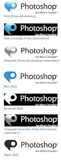
The blogosphere has begun commenting on the new mark already. And while most critics appreciate the need for a distinct Photoshop brand and approve of the new tagline, the logo mark has receved very mixed reviews. Uncertain whether the mark is meant to represent a dialogue bubble, a stylized P, or both, many commentators have noted its similarity to the vast suite of Microsoft Office product logos for Mac. And, perhaps more to the logo's detriment, its reliance on the rapidly aging Apple Aqua graphic style.
For our part, we were struck by the conceptual discontect between the logo and the product. As a dialogue bubble and as a polished vector-like shape, the mark is little reminiscent of the type of image and pixel-heavy work users expect from Adobe Photoshop. We immediately found ourselves asking if someone unfamiliar with the product (and we're sure that person is out there somewhere ... just no where near here) would in turn associate the application's utility with either a communication or illustration service.
Indeed, it is only in the flat versions of the logo that the styled P shape becomes clear and more meaningful, though still straying away from image manipulation and retouch toward vector illustration. We can't help but wonder what this logo harbingers in terms of other Adobe brand redesigns.
Despite these criticisms, the logo will live or die in execution. So we'll be keeping our eyes open for new packaging, screenshots, and websites that exploit the new logo to the fullest. But regardless of the logo's reception, one thing is nearly certain and, to wit, ironic. The new logo was almost certainly created in Illustrator.
Monday, September 17, 2007
Two Designers Enter ... Only One Walks Away
Among stock art websites, Veer holds the coveted position of the design community's sentimental favorite. With its mix of high-end, designer-aimed photos, video, illustrations, merch, and fonts, Veer already stands apart from – or at least toe-to-toe with – its momentous competitors Getty and Corbis. But it is with Veer's ideas that we find particular pleasure. Its mixture of activities, events, and head-to-head combat entertain, inspire, and distract – all the necessary ingredients to fight boredom.
Wait. Did we say head-to-head combat?
Indeed! Veer recently began featuring competitive lightboxing. Two designers are invited to create designs based on a particular theme, from products in a preselected lightbox typically consisting of six images and/or typefaces chosen by the Veer creative team. Our first round was a quirky Fembot-themed contest between British designers Rian Hughes and Jon Hicks. From there on, we were hooked.
For those not familiar with the terminology here, a lightbox was once an illuminated panel upon which photographic slides would be sorted and viewed. It has recently taken on the additional meaning of a folder or directory in which stock art assets are gathered and organized.
The rules are simple: The designers are challenged to make something great. They can use any software they want. Crop. Cut. Paste. Use filters. Fight dirty. Write copy. Whatever they need to do to make a knockout design. Veer's judges then comment on the designs and choose a winner using a highly sophisticated and completely subjective scoring system based on originality, effectiveness, and gut reaction.
Lightboxing was inspired in part by Coudal's Photoshop Tennis (recently back from a long hiatus as Layer Tennis) and Speak Up's Word It. But regardless of its origins, lightboxing makes for a great time waster. Even the lackluster bouts are worth it for the judges' biting criticism. There's even an archive of past lightboxing matches to further distract and entertain once the current rounds have been exhausted.
Now if only we could figure out to join this particular fight club. Like Tyler Durden's ubiquitous group, no one's talking. But rest assured, if we ever figure out to get ourselves in the ring, we won't sit quiet about it.
Sunday, August 5, 2007
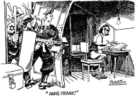
Doug Marlette, 1949-2007
In early July, at the age of 57, Pulitzer Prize-wining illustrator and editorial cartoonist Doug Marlette was killed in a car accident in Mississippi. As fans of Marlette's work, and students of visual communication, we wanted to take a moment to remember...
Marlette won his Pulitzer in 1988 for cartoons he drew for the Atlanta Constitution and the Charlotte Observer. He also worked at New York Newsday and The Tallahassee Democrat, and wrote two novels. In addition to his work as a editorialist, Marlette was also the author and illustrator behind a Zen-master garage mechanic (Dub), a tobacco-chewing preacher (the Rev. Will B. Dunn), and other residents of a fictional Southern town called Bypass. His syndicated comic strip, Kudzu, offered what scholar John Shelton Reed calls an "idealized South."
At the time of winning his Pulitzer, Marlette said that his biting approach could be traced in part to "a grandmother bayoneted by a guardsman during a mill strike in the Carolinas. There are some rebellious genes floating around in me."
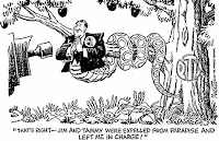
Marlette was among the first to poke fun at Jim and Tammy Faye Bakker. Of his criticism of the televangelists, Marlette once said "I was into televangelists before televangelists were cool." Marlette, who grew up a Southern Baptist, said Jim Bakker used to call him a "tool of Satan." But Marlette, perhaps, had the last laugh. His Pulitzer entry included a controversial cartoon that depicted Jerry Falwell, who at the time was in charge of the PTL ministry, as the serpent in the Garden of Eden.
Of his trade, Marlette wrote in 2006: "The American cartoon was born in revolution. (The very first, designed by Ben Franklin, showed a snake cut into eight segments, each representing one of the colonies. The legend above it read "Join or Die.") The best political cartoons ... are always created in the spirit of the Prague Spring and the Velvet Revolution. They question authority, challenge the status quo and are inevitably accused of "Disturbing the Peace," borrowing the title of one of Václav Havel's books. If the editorial cartoons are doing their job, efforts will be made to suppress them."
And, as you might expect, Marlette's was often of such inflammatory nature. Aside from his attacks on the PTL (which elicited a vicious counter-campaign from the Christian organization), of more notable controversial pieces were his often scathing criticisms of Israeli policy toward the Palestinians and his Southern-tinged views on the lingering crisis of American racism (including an infamous cartoon attacked by Chicago mayor Daley).
But Marlette saved some of his most scathing commentaries for his own industry. Notably, he lampooned the New York Times for lacking the guts to hire an editorial cartoonist for its op-ed pages. Any self-respecting newspaper in a democracy, Marlette argued, had an obligation to use cartoons to convey its perspective and bring the subjects of its news coverage down to earth. If the Washington Post and the Los Angeles Times had Pat Oliphant and Paul Conrad, why didn't the newspaper of record have its own?
In a 2003 issue of Columbia Journalism Review, Marlette wrote on the outrage that at times surrounded his work: "We don't need the First Amendment to allow us to run boring, inoffensive cartoons. We need constitutional protection for our right to express unpopular views. If we can't discuss the great issues of the day on the pages of our newspapers fearlessly, where can we discuss them?"
In a like vein, Marlette infamously attacked the quisling journalists who apologized for the Danish cartoons of the prophet Mohammad. In a 2006 article for Salon.com, he wrote, "by caving in to fanatics over the Danish cartoons, the West has shown that it is not only gutless but brainless ... 'them damn pictures' ... have exposed not just the internal dynamics of what some have called Islamofascism but the corresponding corruption of our own values and character in the West. Our insides have been illuminated like an electrocuted Daffy Duck in an old Warner Brothers cartoon. And we now see what we're made of: not a lot of guts, or brains either."
He goes on to say, "I can see little reason -- other than bodily fear, bottom-line self-preservation, and just poor judgment -- that the U.S. media and the public officials entrusted with defending our freedoms wimped out so thoroughly when challenged to live up to their historic obligation under the First Amendment to keep the American public informed. When we withhold information in the name of a misguided sensitivity, by default we allow nihilistic street mobs from London to Jakarta to define the debate in this country. In effect, we have capitulated to intimidation and threats and negotiated with terrorists. No need for Zarqawi to behead us. We do it ourselves."
This is not the first time that Fight.Boredom has addressed Marlette's work. Back in 2003, we took a look at the impact and emotional power of editorial cartoons. Then, we focused on the visual communication, in editorial illustration, of the 9/11 disaster, the resultant national malaise, and the loss of the space shuttle Columbia.
Part of that discussion included a reflection on the January 28, 1986 destruction of the space shuttle Challenger.
The first editorial cartoon this author can remember is Doug Marlette's weeping bald eagle, furtively drawn for the afternoon edition of the Charlotte Observer. This simple but powerful reaction to the destruction of the Challenger is fixed in my mind even now, as rich in pen and ink detail as video of the blasted debris and veering SRBs are from that day's overwhelming news coverage. As a young boy, in love with space and overjoyed by the fortuitous timing of the Challenger's launch and my birthday, that devastating white explosion knocked my feet out from under me. If anything good came out of my first encounter with national tragedy, it might be found in Marlette's eagle. In that simple composition I understood the power of applied and thoughtful art. In that single tear, I got it.
Thanks, Mr. Marlette.
Wednesday, July 18, 2007
Cloudjammer's 2007 Playlist
The members of the Cloudjammer Creative Network are notorious music junkies (whether or not that makes us connoisseurs is open to debate). In our offices, studios, and homes, we keep the music playing all day long, beating away the silence with a wide variety of the best music available – from classic tunes by Billie Holiday, unpublished college rock and the newest indie, brit rock, hip hop, and southern "rawk" on the market.
Sample some of the music on Cloudjammer's playlist – from perennial favorites to this season's newest additions. If you like what you hear, jump off to iTunes or Amazon and flesh out your own library. Also, don't forget to check out our favorite tracks from last year (or the year before)
Listen to samples from this issue's playlist
Happy listening! fb
Birds&Wire "Oh My"
from the album "AthFest 2007, Volume 2"
Buy this song on iTunes | Listen...
A recent Athens, Georgia discovery, Birds&Wire mixes jazz, country, folk, and indie rock to create soaring sound. We hope they get an album out soon.
Drive-By Truckers "The Living Bubba"
from the album "Gangstabilly"
Buy this song on iTunes | Listen...
The prolific Truckers deliver a powerful song about a musician living with AIDS – part dirge, part defiance. We've been hooked on this song for months.
Floyd the Locsmif "Still Luv' Huh"
from the album "Divine Dezignz #1.2: Re-Discovered"
Buy this song on iTunes | Listen...
A perfect blend of hip hop beats, old school soul, and electronic chop, this track is trendy, sexy, and certain to keep your head bobbing.
Billie Holiday "Strange Fruit"
from the album "AthFest 2007, Volume 2"
Buy this song on iTunes | Listen...
A 1939 jazz classic, this signature Holiday song beautifully and graphically depicts a lynching in the early century South. A powerful track.
Ray LaMontagne "Be Here Now"
from the album "Till The Sun Turns Black"
Buy this song on iTunes | Listen...
Acoustic guitars, gentle strings, piano, and quiet drums create an symphonic and original sound that first captivated us in the trailer for Away From Her.
People In Planes "Falling By the Wayside"
from the album "As Far As the Eye Can See"
Buy this song on iTunes | Listen...
An atmospheric track with layered vocals and lush instrumentation gives this UK indie band's music a hint of Radiohead and Muse.
Peter Bjorn and John "Young Folks"
from the album "Writer's Block"
Buy this song on iTunes | Listen...
The whistling song! This addictive track represents the Swedish trios departure from their earlier pop-heavy rock to a more satisfying, and fun, indie variety.
The Presets "Girls And The Sea"
from the album "Beams"
Buy this song on iTunes | Listen...
A trobbing electronic track reminiscent of She Wants Revenge but with a more melodic instrumentation and smoother vocal delivery.
Venice Is Sinking "Arkansas (Thoughtbeat Remix)"
based on the album "Sorry About the Flowers"
Buy this song on iTunes | Listen...
An Athens band of the R.E.M. vien, this alternative group combines cello, viola, flute, and violin with the traditional rock ensemble to great effect.
Amy Winehouse "You Know I'm No Good"
from the album "Back To Black"
Buy this song on iTunes | Listen...
This English soulstress brings a doo-wop, sexually charged sound reminiscent of the Ronnettes with lyrics that would do Sinatra and Ray Charles proud.
Tuesday, July 17, 2007
The User Trend Away From 800x600
From time to time, we are asked to give recommendations regarding the target screen size for an online or interactive project. Over the years, several Cloudjammer creative professionals have researched this issue. But in the last year or so the canon 800x600 pixel design specification has come under more serious criticism.
According to W3Schools.com, a developer’s resource, as of January 2007, 80% of computers use a screen size of 1024x768 pixels or larger while only 14% use 800x600 or smaller (in fact, since 2005 the next smallest size, 640x480 pixels, has been used by an inconsequential percentage of user). Certainly, 14% is not an insignificant percentage but the studies’ margin of error (6%) could raise the larger resolution’s market share as high a 86%.
Perhaps a better indicator of user habits, though, is the dramatic trend away from 800x600 toward larger screen resolutions over the last five years (see figure at right). If trends continue, 800x600 may soon be relegated to the same negligible status as 640x480 (itself, once the design standard, for those of use who remember web design in the late 90's).
Does this mean that web- and interactive designers should target the 1024x768 dimensions a the new standard? Of course, the answer depends on the intended audience. Ideally an interactive design should expand and condense gracefully, suiting both large- and small-format users equally well. But for most applications, especially the business-to-business and consumer-facing projects in major metropolitan areas with a broadband high market-saturation, designs that target the larger screen proportions are appropriate. What's more, these larger designs may be better suited to service interactive customers in the future, as 800x600-limited users become a smaller and smaller minority.
Friday, June 1, 2007
Will Uncle Sam Defeat the Silver Surfer?
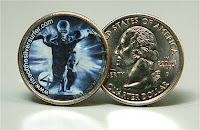
In trailers for 20th Century Fox’s upcoming Fantastic Four: Rise of the Silver Surfer, Galactus' space-born herald is shown effortlessly batting away U.S. Army missiles. Yet a recent advertising snafu on the part of Fox and The Franklin Mint may bring more guns to bear on the Silver Surfer than even he can evade.
Recently, Variety reported that Twentieth Century Fox and The Franklin Mint created a Silver Surfer U.S. quarter and put it into very limited circulation in advance of the release of Fantastic Four: Rise of the Silver Surfer. 40,000 quarters – 800 per state – were released into the currency stream prior to the Memorial Day weekend after being dispatched to cities across the country in special silver armored trucks.
The problem is the coins are illegal. Turns out Fox and The Franklin Mint forgot to tell the U.S. Mint about their ambitions for the Silver Surfer and his related, now defaced, coinage. Indeed, The Franklin Mint created the illegal tender – a California state commemorative quarter minted by the U.S. Mint but color-enhanced by The Franklin Mint – without the cooperation, or even awareness, of the government.
According to the E! Online report that broke the story, the U.S. government said in a statement, "The promotion is in no way approved, authorized, endorsed, or sponsored by the United States Mint, nor is it in any way associated or affiliated with the United States Mint." The feds said they didn't know about the promotion until contacted by the media for comment.
All of this might be just an amusing mistake were it not for one small point: It is a federal crime to turn any form of legal tender into a form of advertising.
Fox maintains that it was unaware that government sign-off was necessary. The studio released its own statement saying it did not intend to break the law or "suggest that there was any approval from the U.S. Mint or the U.S. government."
Unaware that government approval was required for the creation of new or modified U.S. currency? Really? Rather than fining the Fox and The Franklin Mint teams responsible for the Silver Surfer’s flight into infamy, perhaps the government should send teams of local high school civic teacher to educate the wayward advertisers on the basics of American currency.
Fox's hope was that potential movie-goers who found the quarters would go to the website and take part in the Search 4 Silver campaign, a promotion that included registering to win a trip for four to the world premiere in London. Nor is this the first time U.S. currency has been defaced for advertising or commercial purposes. Almost ubiquitous now are the legion of bill crawling through cash register bearing the URL of Where’s George, an online currency tracking engine.
And while Fox and The Franklin Mint will have to answer for their offense, the $10,000 in Silver Surfer coins that were distributed throughout the country, along with whatever fine the government levies against them, will no doubt be less than what it would cost to generate the same amount of headline-grabbing publicity that the criminal coins have. Perhaps only if Fox and The Franklin Mint are found to have knowingly violated Treasury regulations – having weighed the cost of compliance against the cost of fines and found criminality the cheaper route to publicity – can a worth-wild penalty be enforced. Else, how can the government police future violations of U.S. currency when the benefits of violation are so profitable?
For our part, we’re just glad to see the Fantastic Four franchise keep pace with its advertising precedent.
Fantastic Four: Rise of the Silver Surfer opens June 15. Check your quarters before you get to the ticket booth.
Tuesday, May 22, 2007
Arabic in Graphic Design: Rethink Bias
We recently came across a series of three Arabic-language posters that impressed us both with their simplicity and their powerful message. The ads, shown below, feature striking and visceral Arabic calligraphy (read from right to left) written across yellowed vellum. The immediate impression is of ancient tracts – Western stereotypical concepts of violent Islamic texts. But in small print beneath the fuṣḥā, English translations reveal the benign -- even silly -- nature of the menacing Arabic text.
The ad series appears, and reads:
"Paper or Plastic"
What did you think it said?
"Rock, Paper, Scissors"
Misunderstanding can make anything scary.
(According to my own translation, the poster more accurately reads "Rock breaks scissors, scissors cut paper, paper covers rock.")
"I'm a Little Tea Cup..."
We fear what we don't understand
The Martin Agency (including art director Mark Brye, copywriter Cedric Giese , creative director Joe Alexander, and calligrapher Saba Abad) created the ad campaign for the Richmond-based non-profit A More Perfect Union. The mission of A More Perfect Union is to increase respect and understanding between religious and ethnic majorities and their Muslim, South Asian, and Arab counterparts in Virginia.
As of this writing, A More Perfect Union is running these posters as a public service campaign on over 170 buses in the Richmond area in the hope that the public service ads with provoke a conversation about people fears and hopes. As their website claims: "Even negative comments can be a starting point for discussion and growth. Love your neighbor pre-emptively."
And the campaign appears to be working. Bus campaign feedback posted on RethinkBias.org runs the gamut from complimentary ("Congratulations on your brilliant Arabic sign campaign!") to cynical ("Interesting idea. How do I know what the signs really say?") to thoughtful ("I have never thought that some of them may not want to hurt us") to hateful ("There is no hope of peace on earth as long as islm [sic] exists....period").
Wednesday, May 16, 2007
Cloudjammer and J.D. Jordan Featured in "The Graphic Designer's Guide to Better Business Writing"
Cloudjammer Studio and creative professional J.D. Jordan appear in Allworth Press’s newly released design industry text, The Graphic Designer's Guide to Better Business Writing by Barbara Janoff, Ruth Cash-Smith. The book makes use of various Cloudjammer written assets, including its standard long proposal, mission statement, and J.D. Jordan’s professional resume.
The book tackles one of the creative industry's most persistent problems: visual designers and artists’ unfamiliarity and discomfort with the written word. Visual-thinking graphic designers sometimes struggle to express themselves clearly and effectively in writing. The Graphic Designer’s Guide to Better Business Writing teaches graphic designers how to write compelling business communications. Created especially to address the needs of graphic designers, this handy guide breaks the writing process down into simple, easy-to-understand stages and offers practical writing and presentation models that designers can put to use immediately. Real-life examples cover an array of essential topics: writing winning resumes and cover letters, landing accounts, writing polished letters and reports, creating design briefs, and much more. As a bonus, the authors include time-saving insider tricks of the trade, gleaned from interviews with design professionals and creative directors from across the country.
Author Ruth Cash-Smith contacted J.D. Jordan after reading his Newsweek MyTurn editorial in September 2005. After a series of phone interviews, Cloudjammer Studio and J.D. Jordan made various assets available to Cash-Smith and her co-author, Barbara Janoff. In The Graphic Designer's Guide to Better Business Writing, Cloudjammer’s standard long proposal – cost estimate, studio background, portfolio case studies, process, scheduling, and working agreement (pp.121-126) – is used as an example for other designers to work from while the studio’s mission statement is used as an example of professional, concise business writing (p.221). Alongside these corporate samples, J.D. Jordan’s resume is used as the functional example of a midcareer designer (pp.61-2).
According to J.D. Jordan, “the book serves as a good starting point for designers either just getting started or veterans who need to write their own materials. Writing is just as germane to a good graphic design business and career as are skills with Photoshop, InDesign, or Dreamweaver. I was flattered to have been involved with the book’s creative process and thrilled to see some of my own and Cloudjammer’s assets in prints. As good examples, no less.”
The Graphic Designer's Guide to Better Business Writing can be purchased through Allworth’s website or though other online book vendors, such as Amazon.com.
Other texts that have helped Cloudjammer’s creative professionals in terms of business management and professional writing include:
Cameron Foote’s The Creative Business Guide to Running a Graphic Design Business
Graphic Artists Guild Handbook: Pricing & Ethical Guidelines
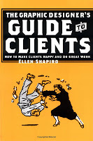
Ellen Shapiro’s Graphic Designer's Guide to Clients: How to Make Clients Happy and Do Great Work
Sunday, February 11, 2007
iChe
About this time last year (March 2006) Communication Arts magazine ran a cover story about graphic design in Cuba that featured a two-color interpretation of Alberto "Korda" Gutierrez's iconic image of Argentine Marxist revolutionary Che Guevara by modern Cuban graphic artist Edel Rodriguez.
The original image was taken by Cuban photographer Korda at a memorial service for the victims of the 4 March 1960 explosion of the Belgian arms transport "La Coubre" in Havana harbor – a disaster that cost the loves of approximately 136 people. Korda was a staff photographer for the Cuban newspaper Revolution, and used a Leica camera to photograph two frames of Che as he appeared briefly on stage during a lengthy speech by Fidel Castro.
The original photograph is a 6x10 inch silver-gelatin print entitled Guerrillero heroico (Heroic Guerrilla). Korda's image of Che has become one of the most reproduced and recognizable images of the 20th century – called by some "the most famous photograph in the world and a symbol of the 20th century". And Korda, for his part, was not opposed to such reproduction s long as it served appropriately revolutionary purposes. On this point, he is quotes as having said, "As a supporter of the ideals for which Che Guevara died, I am not averse to its reproduction by those who wish to propagate his memory and the cause of social justice throughout the world, but I am categorically against the exploitation of Che's image for the promotion of products such as alcohol, or for any purpose that denigrates the reputation of Che."
Thus enter Edel Rodriguez's new composition of Che, featuring the Nike swoosh on his beret and iPod ear buds snaking down his neck.
Like Korda, Rodriguez is a Cuban-born artist. And as he grew up in revolutionary Cuba, he became intimately familair with Korda's iconic image, drawing the famous image of Che about hundreds of time starting around age 3. Of this habit, Rodriguez writes, "It’s everywhere, so it’s what I drew, along with tanks, guns, and missiles, cause that’s what was on T.V. there. American kids draw superheroes and cartoons instead. Che was my Mickey Mouse."
Now, living in the U.S. and benefiting from a successful career in design, Rodriguez's interpretation of Korda's photograph brings the story of Che (and his likeness) full circle.
Rodriguez writes of his inspiration for the new design, "My family that is still in Cuba just got access to the internet, e-mail, etc. They are just learning about these i-pods, tech gear, brands, etc. So I’ve started gettting e-mails from them requesting things like memory sticks, i-pods, things with brand names, etc. Years ago I would get letters from them asking for medicine or food. So, the idea that Cuba is slowly changing into a capitalist society is what came of this communication with my family back on the island. And this image was the result.
"Another thing that has bugged me over the years is all these people with Che t-shirts and the whole Che cult. People that have no clue what a cold blooded killer Che was and how many people’s lives were ruined by the Cuban revolution (Not well to do folks, but artists, musicians, poets, homosexuals, or anyone that had individual ideas and expressed them.)
"So, people here in the U.S. that are all underground and hipster and “original” with the Che gear and that all wear the same brands and listen to their iPods annoy me. They try to act all rebel and counterculture but they’re all fitting in in their own way. I think this image worked for me as a criticism of such an attitude as well. I am very well aware that doing anything with 'Che' is the biggest cli-'Che' ever."
But we loved it – the masterful irony of a Marxist icon transformed (not my Rodriguez, but, as he notes, by modern pop-art consumers) into a capitalist mascot. Would the revolutionary roll over in his Bolivian grave if he knew what his legacy was fast becoming? Perhaps. Regardless, we felt the story of this image, and the artists behind it, spoke volumes. fb
Saturday, January 6, 2007
Cloudjammer Designers Present FBtees!
In Fall 2006, Cloudjammer launched the FBtees collections – a line of custom-designed tee-shirts and gifts through CafePress.com, accessible at cafepress.com/fightboredom.
The inspiration for the FBtees collection was launched with two pilot designs: "Chicks Dig Historians", a design conceived to satisfy a growing demand among J.D. Jordan's colleagues in the UGA history department; and "Got Pie?", a double-edged question loaded with double entrendre. As the site reminds, "the ladies are crazy about historians. Is it the mad moneyz? Is it the suave, polished personae? Who can say... but there is not doubting it" and "you can tell a lot about a man by how he eats pie: Does he take a big piece? Does he gorge the filling? Does he eat it quickly or does he savor it?"
Since the site's launch, the popular designs have consistently been those loaded with nostalgic, fandom, or euphemistic value. FBtee's Old School Mac Icon line, lets people wear their love for their first 8-bit 1984 Macintoshs, showing the word their passion for those old black and white SEs cooling in the veteran mac-users' attics. "Can't load the finder? Not with these iconic tees!" An FBtee's fanwear selection, the "I Voted for Roslin" line for Battlestar Galactica fans reminds, as the site declares, "all those toaster-lovers who you voted for and how, if you had your way, that quagmire on New Caprica would never have happened." And a sexually suggestive patriotic design for sailors and sailor's loves, "I (heart) Seamen" has sold very well, especially over the holidays, in women's wear and underwear themes.
Going into 2007, FBtees has expanded to offer 33 designs in hundreds of apparel and gift combinations. Cloudjammer Network designers hope that several new designs will capture the market's interest as did the earlier designs. Watch for tee's showing the wearer's love for the chosen people with our new "Do The Jew" line. Keep a little history and a little irony in mind with the new "Lie Back and Think of England" ('cause it isn't always about want or love ... sometimes it's about country). And remember the funnest city in Georgia with the "I've Died and Gone to Athens" line of apparel and gifts – cause Athen's isn't just the home of the Dawgs."
Are some of the tee's inappropriate or suggestive? Some perhaps even crass? Sure. But we hope they're all as much fun to wear as they were to design and as long as our sales continue to exceed our shop hosting costs ... we'll keep 'em coming.
Subscribe to:
Posts (Atom)