Struggling to design appealing and effective color palettes can be one of the most difficult challenges a graphic designer faces in the course of developing a project. When existing collateral or brand systems leave palette options wide open, it is often challenging to get started with meaningful color exploration.
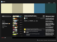
Thankfully Adobe Labs has stepped up to the challenge. They recently introduced Kuler, an online application that helps designers create 5-swatch color systems based on a variety of mathematic rules.
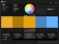
Starting with a single primary color – easily derived or established by even the most remedial comp – Kuler's seven rules help define four complimentary colors and create a usable color palette. Of course, users can manually edit these automatic selections or create their own palette from scratch.
And once a color palette is created, it can easily be exported as an Adobe Swatch Exchange (.ase) file, usable by any of Adobe's Creative Suite 2 or 3 applications (notably, Photoshop, Illustrator, and Flash). The palettes can also be named and shared with Kuler's community of designers.
The result of a great online tool that helps designers quickly generate systematic and complimentary color palettes that can shared quickly among designers and their applications. Kuler speeds up the design process and – and it's fun to play with.
Kuler is available in both a browser-based version built with Flash and a desktop version running on the Adobe AIR runtime.
Saturday, September 29, 2007
Thursday, September 20, 2007
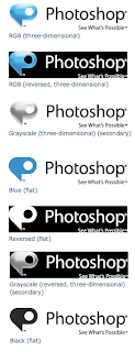
Photoshop's new logo
With all the excitement surrounding the release of Adobe CS3 (and the collective gnashing of teeth over how much worse than CS2 it performs on on our much-loved pre-Intel macs) we were surprised to see Adobe announce this week that it is going to rebrand the software suite's flagship product, Photoshop.
Photoshop has come a long way since its quiet beginnings in 1987 as a graduate student's side project. Somewhere along the way, through a dozen major releases and consolidation into the ever-expanding suite of Adobe's creative products, Photoshop's unique brand identity was submerged. But in its most recent incarnation, featuring an elaborate collection of functionally different flavors (Photoshop CS3, Photoshop CS3 Extended, Photoshop Lightroom, Photoshop Elements, Photoshop Album Starter Edition, and soon Photoshop Express) Adobe has wisely seen the value a unique Photoshop brand might bring to its software offerings.
The blogosphere has begun commenting on the new mark already. And while most critics appreciate the need for a distinct Photoshop brand and approve of the new tagline, the logo mark has receved very mixed reviews. Uncertain whether the mark is meant to represent a dialogue bubble, a stylized P, or both, many commentators have noted its similarity to the vast suite of Microsoft Office product logos for Mac. And, perhaps more to the logo's detriment, its reliance on the rapidly aging Apple Aqua graphic style.
For our part, we were struck by the conceptual discontect between the logo and the product. As a dialogue bubble and as a polished vector-like shape, the mark is little reminiscent of the type of image and pixel-heavy work users expect from Adobe Photoshop. We immediately found ourselves asking if someone unfamiliar with the product (and we're sure that person is out there somewhere ... just no where near here) would in turn associate the application's utility with either a communication or illustration service.
Indeed, it is only in the flat versions of the logo that the styled P shape becomes clear and more meaningful, though still straying away from image manipulation and retouch toward vector illustration. We can't help but wonder what this logo harbingers in terms of other Adobe brand redesigns.
Despite these criticisms, the logo will live or die in execution. So we'll be keeping our eyes open for new packaging, screenshots, and websites that exploit the new logo to the fullest. But regardless of the logo's reception, one thing is nearly certain and, to wit, ironic. The new logo was almost certainly created in Illustrator.
Monday, September 17, 2007
Two Designers Enter ... Only One Walks Away
Among stock art websites, Veer holds the coveted position of the design community's sentimental favorite. With its mix of high-end, designer-aimed photos, video, illustrations, merch, and fonts, Veer already stands apart from – or at least toe-to-toe with – its momentous competitors Getty and Corbis. But it is with Veer's ideas that we find particular pleasure. Its mixture of activities, events, and head-to-head combat entertain, inspire, and distract – all the necessary ingredients to fight boredom.
Wait. Did we say head-to-head combat?
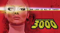
Indeed! Veer recently began featuring competitive lightboxing. Two designers are invited to create designs based on a particular theme, from products in a preselected lightbox typically consisting of six images and/or typefaces chosen by the Veer creative team. Our first round was a quirky Fembot-themed contest between British designers Rian Hughes and Jon Hicks. From there on, we were hooked.
For those not familiar with the terminology here, a lightbox was once an illuminated panel upon which photographic slides would be sorted and viewed. It has recently taken on the additional meaning of a folder or directory in which stock art assets are gathered and organized.
The rules are simple: The designers are challenged to make something great. They can use any software they want. Crop. Cut. Paste. Use filters. Fight dirty. Write copy. Whatever they need to do to make a knockout design. Veer's judges then comment on the designs and choose a winner using a highly sophisticated and completely subjective scoring system based on originality, effectiveness, and gut reaction.
Lightboxing was inspired in part by Coudal's Photoshop Tennis (recently back from a long hiatus as Layer Tennis) and Speak Up's Word It. But regardless of its origins, lightboxing makes for a great time waster. Even the lackluster bouts are worth it for the judges' biting criticism. There's even an archive of past lightboxing matches to further distract and entertain once the current rounds have been exhausted.
Now if only we could figure out to join this particular fight club. Like Tyler Durden's ubiquitous group, no one's talking. But rest assured, if we ever figure out to get ourselves in the ring, we won't sit quiet about it.
Subscribe to:
Posts (Atom)