Like many folks, I was entranced by HBO’s recent series
Game of Thrones. So much so, in fact, that certain house words have entered my vernacular and that I took the unprecedented step of reading the books after watching it
—a feat only previously accomplished by Chuck Palahniuk’s
Fight Club. And, sure, the acting was great (Peter Dinklage absolutely deserves the Emmy) and the story was engrossing in all its bloody, incestuous, and betraying soap-operatic brilliance but these are things we’ve come to expect in our much lauded, current golden age of television. No, what piqued my creative interest wasn’t the narrative storytelling,
per se, but rather the visual storytelling
—both the art direction of the show's effects and the mindblowingly original opening credits.
As consumers of TV pop culture, I suspect most of us aren’t aware of how much of what we see on the little screen
—from the most fantastic to the most mundane
—is accomplished with the use of virtual backlot. But a fantasy series like
Game of Thrones invites examination and, thankfully
BlueBolt, the company behind the show’s effects, has put together a effects reel to show you just how many and much of your favorite Westerosi settings are pulled from the bowels of a computer. Expecting elaborate effects, I was still surprised how much certain cornerstone sets
—Winterfell, in particular
—are artifice. It’s definitely worth a look (though there are spoilers aplenty late in the reel):
But the more daunting creative challenge Game of Thrones faced wasn’t just how to create a convincing look and feel for Westeros (which they certainly did) but, rather, how to orient the audience in a new world with unfamiliar geographies, politics, and history. Most genre and historical features meet this challenge with the standard map-and-sonorous-voice technique whereby a map of Middle Earth or Ancient Rome or the Pondarosa is presented, showing the lay of the land while a deep, male voice evokes the setting in brief turns of ominous phrase.
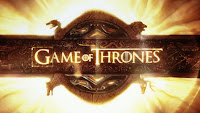
Game of Thrones does away with this precedent. In its places is a complicated opening sequence that is both a work of art and a layered info graphic. Through the use of an inverted globe, mechanical geographies, and an burning solar astrolabe (armillary sphere, to be specific) the lands, specific settings, heraldry, and dynastic history of the Seven Kingdoms is communicated quickly and stylishly. And that the opening sequence changes several times over the course of the season, orienting the audience to new locales
—keeps each episode’s introduction relevant to the action at hand.


 You can read a full interview with with Creative Director Angus Wall of Elastic about the Game of Thrones opening credits over at Art of the Title. And I encourage anyone in fiction, film, or infographics to do so—it’s a fascinating look behind the curtain of the two-year process that produced the best title sequence on television. FB