Thursday, December 5, 2002

Holiday Gift Picks

This holiday season we took a look at three of the hottest gift picks on our wish lists. Take gander before heading out to the mall:
Patrick Greer – Nintendo Gamecube

There are an amazing number of fun, new and interesting toys that would make ideal gifts. My thoughts went out to these items for Christmas – from PDA’s to computer games to a few books I would just love. The thing that I kept falling back to, though, isn't new at all. It's actually a throwback to the youth I remember so fondly. The Nintendo Gamecube adds the great characters I adventured with as a child to a new world of animation and graphics.

They have created a wonderful game console that amazes the eye with its sharp look and small size – the controllers are actually larger and more cumbersome then the box itself! The size of the Gamecube is no reflection of its power; it can hold its own compared to Microsoft's Xbox or Sony's Playstation 2 (and for a good bit less on the price). Then, of course, you get the wide variety of new games that Nintendo has released and their ability to reuse some of their trademark characters and stories in fun new ways to entertain all ages.


J.D. Jordan – The Apple iPod
Perhaps this is an extremely biased pick, but the Apple iPod is just about the coolest thing on the planet for the tech-savy person on your holiday shopping list – Mac-user or not. The iPod, a harddrive MP3 player, comes in 5mb, 10mb, and 20mb models (the 20mb model can hold 4,000 songs...who dosen't need that?) for Mac and PC. The biggest perks go, of course, to the Mac users who can sync thier desktop Macs to their iPods through Apple's own MP3 software, iTunes.

The iPod interface is truly a delight to use – browse your song list either with a rolling navigation wheel or with the earphone remote. All models also come with digital address and phone books, an integrated day planner, fast-charge batteries, and 20 minutes of skip buffer. The 10mb model has recently been upgraded to be thinner (less than three-quarters of an inch thick), lighter (6.5 oz), and more resistant to dust and debris. You can even get it engraved. And it's only $299, $399, or $499 (only...)


Fleming Patterson – BlackBerry Internet Edition
Now this is a product that is portable and has the functionality for just about all your business needs in the palm of your hand. The BlackBerry Internet Edition is a wireless solution that provides access to your existing email anytime, anywhere. It’s a personal organizer that is fully synchronized with your desktop computer. There's a peace of mind that comes from knowing you are always connected. It is like having your office in your pocket.

The BlackBerry has a good nationwide wireless data network and also has an Internet browser that can obtain important information while you are on the go. EarthLink is currently offering the Blackberry at around $349.00-$399.00 with a monthly service of $39.95 per month with optional web access at $9.95. More information can be found at EarthLink’s BlackBerry site. fb

When Did We All Become the Griswolds?

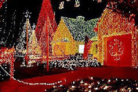
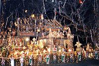
What to do with the extra 100,000 lights in the atticTake note of the candy canes in the tree canopyHow many good-taste violations can you find on this house?There are two Christmas movies that we watch every year, without fail. A Christmas Story and National Lampoon's Christmas Vacation.

Of course, for the purposes of this discussion, the story of Ralphie and his quest for a Red Rider bee-bee gun really avails us little. The Griswold family Christmas, on the other hand, serves us perfectly. Anyone who has seen the film must remember how, when Clark Griswold (Chevy Chase) finally illuminated the outside of the house – every square inch of the house – he blew the local power grid. He even sent his neighbors reeling away from their windows, shielding their burned eyes from the light. One also cannot forget how, in the tumultuous familial climax, Clark's plastic Santa Claus and reindeer were launched from the roof by an explosion of pent-up sewer gasses.

Good times. Good times.

Exploding sewer gas or no, this makes me think (and how many Chevy Chase movies do that, I ask you). Is the current state of outdoor holiday decoration the real culprit for the west-coast power crises? Is string-light proliferations a threat to our communal sense of decency?

You only have to drive through any neighborhood in any American community to see what I mean. Christmas lights climbing every light pole and tree, hanging from every awning and lintel. The pale of these lights is enough to examine jewelry by. Down in Chastain Park, for instance, the difference between night and day is more a factor of household voltage than ambient light.

But don't get me wrong. I like the tacky light tours as much as anyone else. My family has long practiced the slow Christmas Eve drive through Sandy Springs and Dunwoody – jaws agape, chuckles frequent – just to see this year's batch of offensive holiday dedications.

I just wonder when it was, exactly, that we lost our good taste and humility. Is this another case of technology running amuck? Has holiday light progress outpaced the moral sense of right and wrong for icicle lighting?

Let's take a look at some of the worst offenders:
  • The illuminated Santa. You see him every year. Climbing into a chimney, waving from the front yard, or leading his sleigh skyward behind his team of reindeer (usually one...the whole team would be prohibitively expensive for any but the most terrifyingly Christmas obsessed light enthusiast).
  • Writing. "Noel" is the most common text, with "peace" and "merry Christmas" falling is just behind. I keep waiting for one to just say "Look at me!"
  • Outlined reindeer. At least they don't come in multi-color blinking versions. Yet.
  • Lighted manger scenes. Nothing honors the birth of the Christian savior quite like his birth done in three-color running lights. Those flashing light behind the manger? A keno board.
  • Giant menorahs. The Christians don't have all the fun, though. More common than the lighted crosses or stars are the lighted menorahs that come out to the front yards every Hanukkah.
  • Christmas villages. The most awful holiday light configuration – outside of amusement parks and community centers, of course. What prompts the casual citizen to wake up one Thanksgiving and say, "You know what my holiday decor could use this year? An entire Christmas village on the front yard!"
  • Out of season displays. There is no excuse, whatever the reason, for having "Happy Christmas" written across the roof of your house in July. None. That's all we need to say about that.
Of course, we're exaggerating. It's just that when I remember decorating the house as a kid, we didn't have all these terrible options. The biggest dilemma was white lights or colored? Small lights or big fat ones? Blinking or static? Icicle lights didn't even exist yet! For the record, we used to decorate the house with small, white, static lights – inside and out. They're what we still use. The only stings of colored lights I've ever used were dorm-room decor. Frankly, that's where they belong.
But not all advances in yard illumination science are bad. I could kiss the person who developed the white-light net. Lighting the bushes takes a tenth of the time it used to. The innovation I really long for, though, is the light string that can be conveniently stored in the box it came in. I'm a pretty meticulous person, but, I swear, the lights grow after they come out of the box...no way they'll ever fit in there again.

We're critical. It's what we're paid to do. But we love the holidays and all the bad taste that comes with it. I suppose the greatest paradox isn't how a sophisticated civilization like ours sinks, once a year, to such decadent lawn lighting. It's how we can listen to "Grandma Got Run Over by a Reindeer" while doing it.

Happy Holidays. fb

Critical Issues in Print Series, 2: Paper & Ink

Fight.Boredom recently sat down with local print guru Jeff Herndon, president and founder of the print brokerage firm Aurora Print Services. Jeff has over 20 years experience in the print industry and often works Cloudjammer on print projects.

Fight.Boredom: Paper and Inks. Where do we get started?

Jeff Herndon: Let's start with a recent issue I had on press. A client wanted a PMS metallic ink printed on uncoated paper. PMS only recently started making Metallic inks for uncoated papers, so we had to use a coated swatch to match colors. The front of the business card matched perfectly, but the back, which had solid ink coverage, was way too silver. See, the metallic inks use pigment and silver metal to create their distinct look. On the uncoated paper the green pigment was absorbed and the silver was left floating. We thought it might be a problem with the press, so we ran a print with coated paper – it matched perfectly. The metallic inks interact totally differently with uncoated papers than with coated. This is just an example of how paper and ink specifics can drastically affect your project. You don't always get what you expect when you experiment.

FB: Why do coated and uncoated papers behave so differently?

JH: They're made totally differently, to start with. Coated papers all tend to be made the same way: With basic inexpensive fibers, white colors, and a clay coating – Georgia white clay, incidentally. Uncoated papers have far more issues. Their colors and textures run the gamut. Each uncoated paper will use different pulp and fiber combinations and be tested for different reactions to folding, embossing, and perforation. Each paper might use a different embossing wheel to create texture. And each time you change the paper being made in a paper machine, you have to completely recalibrate the machine. These machines usually run 24-hours a day, so stopping them to reconfigure is no small order. Just look at the prices: the cheapest papers are basic white offset and coated sheets. The higher quality uncoated papers, like Monadnock, which has great paper formation and hardness, are uncoated. Of course, you benefit from using uncoated – your printed materials look better on the premium papers

FB: Can a designer really tell how their printed materials are going to look on coated or uncoated papers, though? Like in the situation you mentioned before...that was a surprise, wasn't it?

JH: All designers should compare sheets on a press inspection…to see how the different papers react to the printing. Some things you can expect, though. Uncoated papers, for instance, absorb ink as it dries. On coated sheets, the ink dries on top of the clay finish. You can test this yourself. Take a sheet of uncoated, coated, and newsprint and touch a magic marker to each. The dot will gain about 5% on the coated and maybe as much as 10% on the uncoated. On the newsprint you'll really see it spread. Some mills, like Mohawk, treat their uncoated paper to absorb less ink, so this absorption rule isn't always true. Paper issues are critical to print design. Designers need to educate themselves on paper and ink issues in order the get the best quality product.

FB: Well, we're all professionals here.

JH: Of course you are.

FB: How many Paper Mills are out there?

JH: There are probably 20 or 30 major mills in the US. Most of the paper varieties have become consolidated. International Papers own Strathmore, Beckett, and Via (formerly Hammermill). Fox River owns Howard and several others, about 20 different brands. Mohawk has six or seven papers, Classic has seven or eight. It's a lot to consider. And that's just regular papers. There are also six or seven mills making synthetic papers like UV Ultra – which makes great untearable envelopes – and UV translucents that look like vellums. You've also got specialty papers with suspended materials in them. That could be a whole other article for us.

FB: Sounds like it. What about inks?

JH: Pantone Matching System (PMS) inks are the industry standard, especially here in the South. 4-color process can come close to matching these colors, but they're never are exact. PMS are true colors, not screened composites. 4-color can't match the PMS metallics or florescents at all. The orange that Cloudjammer uses on its business card couldn't be matched at all in 4-color process, remember.

FB: It was a nasty brown, wasn't it? But there are other ink systems than PMS, aren't there?

JH: There's Toyo and a few others. PMS is the standard, though. it's practically a monopoly. Toyo has some unique and different inks that PMS doesn't have, but most printers are reluctant to reformulate the chemistry in their presses to accommodate – especially here in the South where there are fewer and younger printing companies. The presses need to be configured to use different amounts of water, alcohol, and other chemicals used in printing – it's a lot of work. Toyo and PMS are kind of like Macs and PCs: Toyo is the only company that makes Toyo inks, but PMS inks are made by lots of companies and printers like to stick by their regular ink vendors.

FB: If you're comparing the Toyo inks to Macs, I might just have a new favorite ink.

JH: If you really need a Toyo or other non-PMS color for a print job than contact the ink company, PMS or otherwise, to do an Ink pull-down for you before you ever go to press. They can match colors just like Home Depot can. It's better to spend a little money up front than a lot of money making a drastic change on press.

FB: Any closing thoughts?

JH: Uncoated papers may need heavier ink runs to get the same color intensity as their coated counterparts. Papers all have different needs. Mohawk, for instance, requires less water in the press chemistry than most other uncoated sheets. Some small presses can't handle that.

FB: Really like the Mohawk paper, eh?

JH: I really love the way Mohawk prints. But I also know the paper well – its benefits and its problems. That where the designer's education comes in.

FB: Or the print broker's?

JH: Couldn't have said it better myself. fb