Tuesday, December 30, 2008

Creating the Barack Brand

Back in April we talked about how the right brand could make the candidate –even how a font like Gotham could help Barack Obama rise above the primary–season tumult and win the presidency.

Turns out we were right. Oh, snap!

Now that the smoke has cleared, we have the luxury of not only enjoying Barack's transition from the sans-serifed Gotham typeface of a candidate to the serifed stylings of a president-elect, but of looking back in detail on the creation of his runaway brand. Thankfully Sol Sender, formerly of Sender LLC, creators of Obama's iconic O graphic, obliges this curiosity.

In the videos below, Sol Sender tells the story of the conception and birth of the Obama '08 logo, including the strategy behind it, developmental concepts, and finalist designs for the identity not chosen by the campaign. Sender, now a strategist with design agency VSA Partners in Chicago, was creative director and principal of his own design firm, Sender LLC, when he was hired to create the campaign logo. In the fall of 2006, Sender and his team were engaged to do the work by MODE, a Chicago-based motion design studio with an existing relationship with David Axelrod, the Obama campaign's chief strategist. The Obama campaign took on design responsibility for the logo in mid-2007 and extended the identity across multiple applications.

Sol Sender on the Obama logo design, part 1


Sol Sender on the Obama logo design, part 2


All of this points to a refined appreciation for the role of branding and visual communication in national politics. The fact that the Clinton and the McCain campaigns each raced to update their web presences once they were confronted directly with Obama's further testifies to this fact. Hopefully memoirs of the 2008 campaign will, at the very least, give Sender a footnote to reward his creative efforts. FB

Sunday, November 2, 2008

The Death of Album Art

NBC Nightly News, of which Ann is a rabid watcher, recently carried a fascinating piece on the decline and increasing marginalization of album artwork in the recording industry. From the lauded and classic 12" LP dust jacket to the 4" CD sleeve to tiny 1" iTunes thumbnail – and, more importantly, from a $100,000 average expenditure per cover to $10,000.


Watch "The Death of Album Art" at MSNBC.com...

Tuesday, October 14, 2008

What Exactly is Newsweek Trying to Tell Us?

It's no secret that I've got a thing for content analysis and Newsweek. Content analysis is a fantastic method for quantitatively identifying narratives in communications while mass-market newsweeklies – like the evening news or newspapers – represent a closed-system of news communication that captures a specific period of time.

This week's issue of Newsweek, with its almost blank yellow cover featuring Fareed Zakaria's "The Bright Side," gave me pause. While the striking use of color with minimal typography no doubt jumps off the otherwise cluttered newsstand, I wasn't at all sure – based on the cover alone – what the article was about. Turns out, it's a piece on the economic collapse's silver lining. But I didn't know that until I flipped to page 28.

Usually, a magazine cover is a lot more graphically descriptive, selling a specific story with a unique visual hook. But this cover indeed worked. It stood out not only because it was different from the other covers on the shelf, but also because it was different from the steady succession of Newsweek covers that have passed across my coffee table over the course of the last year.

"The Bright Side" and the previous 50 Newsweek covers
October 2007-October 2008


What makes this week's cover so different? As a graphic designer, I first noticed that it broke from a visual theme that Newsweek has established in general since Jon Meacham took the editor's desk and, specifically, in the past year. 31 of the last 51 Newsweek covers have either featured an isolated foreground element on a white background (27) or stark black and white photography (4) that accomplish much the same visual effect. Throughout, accompanying text is treated simply and in uncluttered formats.

This visual trend in Newsweek's covers is striking for two reasons. 1) It creates a unifying visual brand that extends beyond the red masthead and 2) it flies in the face of decades of publishing convention wisdom that says that more color, more visual complexity, and more teaser copy make for more interesting covers.


The second differentiating factor is less surprising. A superficial content analysis reveals that the 2008 election – including its exaggerated primaries – is the overwhelming theme over the course of the past year. 22 of the past 51 issues featured the election on the cover – seven for team McCain and nine for team Obama. So this week's yellowed statement stands in direct visual opposition to a parade of political mugshots likely mirrored on the covers of other newsweekies.

2008 Election themed Newsweek covers
October 2007-October 2008


Ironically, the economy – including the dramatic global market upheavals and the impending recession – only garnered four covers in the same time period. This is especially surprising for covers from August-October 2008, when the current crisis ramped up and came to a head. It is even more surprising when one considers that the economy and the war in Iraq, at four covers each, are tied in second place behind the election as Newsweek cover topics.

Economy/Recession themed Newsweek covers
October 2007-October 2008


It's never just the news. It's also how it's shown. And, in this case, what color, typography, and content you use to create that visual hook. Whether or not Newsweek's new visual trend continues – its political topics certainly will – the previous whitening of the covers set a perfect stage for an otherwise graphically weak and contextually vague cover to jump out and make an impression. FB

Saturday, October 4, 2008

A Branding Perspective on the Wall Street Bailout

BBC magazine ran a facinating article this week begging the question: Could President Bush saved the country – and the world – some financial and political turmoil if used the word "rescue" instead of "bailout?"

Branding expert Jonathan Gabay certainly thinks so. He suggests that Bush's "failure of branding" hurt his chances of selling the $700bn "bailout" package. Indeed, he suggests that a simple game of world replacement might have let the titanic rescue effort sail through Congress.

Take a look at how various branding experts suggest the bailout should have been marketed, from analogies to heroic firefighters to movie trailers. FB

Monday, July 28, 2008

Information Design: America's Conflicts

While recently using AIGA's invaluable Design Archive for some project research, I stumbled across The New York Times' fantastic info graphic,"In Perspective: America's Conflicts." This visualization succinctly and effectively compares the cost, in lives and dollars, of America's twentieth century conflicts – World War I, World War II, Korea, Vietnam, and both Gulf conflicts. The charts likewise compare advances in wartime technology, focusing on the increased precision and efficiency of US air power.


(click on the image to see a larger version)

According to the AIGA Design Archive, the Times' "design problem was to create a large, explanatory figure that would put into a wider context the casualties sustained in Iraq. The design approach remains essentially the same with all informational graphics at the Times: Be clear and be compelling. Design the data so that patterns emerge, not the hand of the designer."

Indeed, our complaints regarding this otherwise excellent visual depiction of data are few. Regarding the incorporation of conflict map, the colors chosen to represent the various theaters are difficult to discern, especially between related conflicts – the world wars, the Asian, and the Gulf conflicts. Likewise, the human cost of World War I, while relevant, is inconsistently depicted. Even without accurate monthly statistics – which I suspect, as a historian, are out there, buried in some archive – World War I's human toll should be represented in a fashion more immediately similar to the later conflicts. And the current conflict could be more accurately depicted if it included the costs of the simultaneous war in Afghanistan and the longer, ongoing insurgency in Iraq.

Regardless of these critiques, the info graphic does an excellent job of contextualizing the last 100 years of US armed conflict – in particular the juxtaposition of the monthly loss of lives during the Gulf conflicts and World War II, a comparison oft made by Washington with, apparently, little basis in real-world comparison. FB

Monday, June 30, 2008

Fun with Branding: Home Depot vs. Al-Qaeda

The following posting is intended for satirical purposes only and is based upon an coincidence of linguistics and marketing. No relationship between Home Depot and Al-Qaeda is suggested.

Back when I took Arabic language courses at UGA in pursuit of my masters thesis, a casual conversation with one of the Arabic program's professors strayed from issues of political and religious import toward matters of international marketing. Namely, the unfortunate linguistic foibles that Nike and Coke once experienced when marketing in the Middle East. But in discussing the potential fortunes and failures future marketers might experience in the region, we struck upon a most troubling linguistic coincidence:

"The Home Depot," he informed me, translated into Arabic, is pronounced Al-Qaeda (القاعدة). We're not making this up. Al-Qaeda literally means "Home Base." And without a more appropriate translation for the word "depot," Al-Qaeda suddenly becomes more than just a threat to the free world ... it's also America's number one Do-It-Yourself warehouse!


In fairness to the Atlanta-based do-it-yourself warehouse, most Western companies transliterate their names when operating in foreign countries rather than translate their names into the local tongue. But such an unfortunate translation might hinder Home Depot's prospects if they attempt to break into the booming Gulf coast markets.

So next time you hear someone say they're headed out to the Riyadh Home Depot for light bulbs, call Homeland Security (202.282.8000), duct tape the windows, and relish in stereotypes. The marketing just about writes itself. FB

Monday, June 23, 2008

Design Humor: 43 Seconds with John Stossel

On the surface, the following video represents 20/20's attempt to correct a long overdue omission – the historical lack of reporting on graphic design on America's longest-running and most-watched news magazine show.

But let the sudden appearance of Comic Sans be your first clue that this "clip" from 20/20 is a parody. In this case, a piece of satirical reporting produced by John Stossel at the behest of Winterhouse's Jessica Helfand for the AIGA National conference last year.

Regardless of its legitimate newsworthiness, enjoy Stossel's ever-so-brief report on three most common design mistakes Americans make.


Just in case you're screwed. FB

Friday, June 13, 2008

Damn Right Your Father Drank It

Just in time for Father's day, we were reminded of Beam Global Wine & Spirits and BBDO Energy's new advertising campaign for Canadian Club: "Damn Right Your Dad Drank It."

Canadian Club's campaign works a familiar theme once employed by Oldsmobile, though from an opposing tack. While Oldsmobile tried to distance itself from its aging audience with the poorly-conceived "It's Not Your Father's Oldsmobile" campaign, Beam Global embraces the older generation exclaiming, variously, "Your Mom Wasn't Your Dad's First," "Your Dad Was Not a Metrosexual," and "Your Dad Had Groupies."

The campaign launched last November with radio, out-of-home, point-of-sale, and print ads appearing in Rolling Stone, Sports Illustrated, Sporting News, Playboy, Men's Journal, Esquire, Outside, and Men's Fitness. These print ads were followed up with a street ad campaign featuring alternative titles ranging from "Your Dad Never Tweezed Anything" to "Your Dad Had a Van for a Reason."

One reviewer has asked if these ads represent an invitation to "return to the glory days of the hard liquor cocktail when beer was for factory workers and wine was for sissies? Can we now go back to the three martini lunch, pinch asses in the afternoon." Indeed, such an implication inspired Michelle Schwartz to launch her own project titled "Your Mom Had Groupies" which invites participants to submit their own designs using a mock Canadian Club template. Ironically, Canadian Club offers their own templated ad maker.

But despite qualms some critics have had over the campaign's overtly masculine tone, the Canadian Club ads do make masterful use of 60's and 70's imagery – from actual Beam Global employees, no less – to position dad as a once-cool man's man. And the ads do tap into a very real introspective process that men go through in their 30s and 40s, have kids, and settle down. They wonder, “Am I becoming my Dad?” Instinctively, we balk at the notion. But here, beneath the macho implications of the advertising copy, we see a representation of fathers everywhere that, if not accurate, is at least humanizing. At best, it's downright desirable.

My dad drove the derided Oldsmobile and avoided these lauded brown liquors. But I am drawn, nonetheless, to this campaign's message that, perhaps, dad was a little less "fatherly" in his youth. Of course, I knew that already. And I always though he was cool, the pimp Oldsmobile aside.

Ultimately, the message of these ads isn't any worse than their bikini-draped and oversexed counterparts in the beer industry. And they certainly aren't as directly sexist as the liquor ads of the late 70s and early 80s. At the risk of being crass, the new campaign's masculine overtones might even prove effective in reaching the target market for no other reason that the nostalgic humor they illicit between father and son.

Happy Father's Day. FB

Monday, June 2, 2008

Behold the Telectroscope!

There is a secret transatlantic tunnel running between New York and London ... and it has lain undisturbed for a hundred years. Now recently completed, this tunnel forms the backbone of an extraordinary optical device allowing people on one side of the world to see the other. Behold the Telectroscope – an incredible public art project by British artist Paul St George that is designed to provide a window between two great world cities, from Brooklyn Bridge in New York to Tower Bridge in London.

Between May 22 and June 15, 2008, this outdoor interactive video installations will link London and New York City in a fanciful simulated "telectroscope." Using broadband internet cable to transmit video images between the two venues at high speed, the Telectroscope gives the impression that the two cities are connected via a massive telescope under the Atlantic Ocean. London visitors will be able to wave down a massive viewing pipe into the earth and see New Yorkers waving back. Perhaps most impressively, this installation represents the first time that spectators will be able to have a real-time, life-size view across the pond 24 hours a day.

According to the Telecroscope's invented back story, the device uses an impossibly long transatlantic tunnel started in the 19th century by the artist's fictional great-grandfather. This story was realized as part of the installation through a series of pre-opening events that depicted huge drill bits erupting from the ground near the Brooklyn and Tower bridges, presumably completing the telectroscope tunnel.

In reality, the term "telectroscope" was first used by the French writer and publisher Louis Figuier in 1878 to popularize an invention he wrongly interpreted as real and ascribed to Alexander Graham Bell. That device would have allowed merchants to transmit pictures of their wares to their customers, the contents of museum collections would be made available to scholars in distant cities, and (combined with the telephone), operas and plays could be broadcast into people's homes. Sadly, this a device was a fabrication – at least inasmuch as it fraudulently claimed many of the properties of the simultaneously developing television.

The Telectroscope installation is a production of the Artichoke company, a London-based live event company best know for its 2006 staging of The Sultan's Elephant, the biggest piece of free theatre ever seen in London. Created by French theatrical magicians, Royal de Luxe, The Sultan's Elephant featured a vast, time-traveling mechanical elephant, and a giant girl, twenty feet high. Hundreds of thousands of spectators followed the show as it moved between the city's great landmarks, delighting in the massive 42 ton elephant made mostly of wood, operated by a team of over ten puppeteers using a mixture of hydraulics and motors.

The Telectroscope is only open for two more weeks – until June15. So if you're fortunate enough to be in London or New York before it disappears back into the earth, swing down to the river and peek across the world. If you're very persuasive, the instillation managers will even let you schedule your visit so that you can meet a friend on the other side of the pond. FB

Monday, May 19, 2008

Outlook 2007: Breaking the Internet One Email at a Time

Great progress has been made, in recent years, to standardize users' online experience across various browsers. Perhaps nowhere has this trend been seen more than in the widespread standardization of CSS rendering in nearly all major browsers (including the new, more-standards-compliant Internet Explorer 7).

The same can not be said of HTML rendering in email. Despite encouraging desktop clients such as Thunderbird and Apple Mail, the world's most popular email client, Microsoft Outlook, recently took a giant step away from standards compliance and, in the process, yanked the rug out from under web- and email-designers everywhere.

Outlook is the preferred email client for business users, representing a staggering – but not surprising – 75% of the corporate email market. And many more people are encouraged to use the email client through its bundled delivery with the Microsoft Office suite of applications. At the same time, private hosting and corporate email storage limitations and privacy policies have resulted in the increased usage of personal email accounts – Yahoo, Hotmail, AOL, Gmail, etc – for commercial marketing messages. Some email marketers have reported that as few as 5% of their recipients access their email through Outlook or similar client applications.

Older versions of Outlook used a combination of Microsoft Word to format outgoing HTML emails and Internet Explorer to visualize incoming messages. Outlook 2007, however, does away with Internet Explorer as its HTML rendering application. Instead, it relies on Word for composing and rendering HTML emails. The result is an email client with very limited support for HTML and CSS – a dramatic step backward from the web standards for HTML and CSS coding and visualization.

Many designers will already be familiar with the limitations imposed by Word's handling of HTML. That professional HTML coding programs have default features designed to clean up and correct Word's code should serve as adequate warning for the rest.

Testing on various coding components reveal that Outlook 2007 does not support:
  • Background Images
  • Cascading Style Sheets (CSS), embedded or linked. All styles must be coded, at each instance of the styled text, into SPAN or FONT tags in the body of the email
  • CSS positioning or floats
  • Flash, or other plug-ins
  • Forms
  • Replacing bullets with images
  • Alt tags
  • Animated GIFs. The first frame is loaded but the animation does not advance.
  • Frames
  • Applets
Outlook 2007 does, however, continue to support:
  • Rowspan attributes in tables
  • Colspan attributes in tables
If email marketing services are right, Outlook (and the minority of adopters who have begun using Outlook 2007) does not represent a significant impact on the viability of commercial emails; The web-based clients for Yahoo, Hotmail, AOL, Gmail and their ilk represent the vast majority of email recipients. But Outlook 2007's failure to correctly render HTML may yet have an impact on response rates of corporate and institutional recipients. This should primarily impact business users and B-to-B mailings.

Regardless of the number of web-based email recipients, email designers will have to consider Outlook 2007's new requirements when creating their pieces. This effectively means that they will have to code for another – fundamentally inferior – rendering engine at a time when nearly all other browsers and email clients are falling in line.

The net result, of creatives, is a reminder to test your creative prior to sending a mail campaign – we can no longer rely on a browser-based test to prove an email's fidelity across clients and platforms. You may want to use Microsoft's tool to tell you which parts of your HTML emails need to be replaced. And you'll certainly want to giving your Outlook-based readers an easy way to switch to text-only email. FB

Monday, May 12, 2008

New Coins for an Old Kingdom

On April 2, 2008, The United Kingdom decided to change its currency.

Not to the Euro ... heavens no! But the august pound sterling – the third-most-common, and forth-most-traded currency in the world – is getting a long overdue face lift. And the new coinage is a graphic dream: an integrated series of seven coins that work individually, as a collective whole, and reinforce the kingdom's royal brand. Naturally, it was designed by a young graphic artist with no experience in currency design.

The UK's Royal Mint launched an open competition to find designs for six of the UK's eight circulating coins in August 2005 (Initially , the £1 coin and £2 coins were not included in the design brief but the £1 was later added to complete the winning set of designs). The competition generated more than 4,000 designs from over 500 people – members of the public, specially invited British artists, artists from other European countries, and members of the Royal Mint Engraving Department.

The Royal Mint launched the contest in an effort to renew and reinvigorate the United Kingdom's coinage almost 40 years after the introduction of the current decimal-based currency system. The Royal Mint's creative brief allowed those taking part a free hand to prepare "a coherent series of designs," encouraging heraldic emblems and motifs but leaving the door open for other ways in which to [symbolize] the United Kingdom and its member states.

The judging process was distinctively British. All of the 4,000 submitted designs were inspected by the Royal Mint Advisory Committee. The committee's preferred design was then recommended to the Chancellor of the Exchequer, in his capacity as Master of the Mint. Finally, his recommendation was passed on to Buckingham Palace and the winning design was approved by Her Majesty The Queen.

Surprisingly, the winner was not a specially invited artists or a member of the Royal Mint Engraving Department. The winner was Matthew Dent, 26, originally from Bangor in North Wales, now living and working in London as a graphic designer. Matthew saw the competition advertised in one of the national newspapers and he threw himself wholeheartedly into the project.

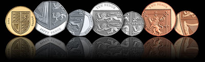
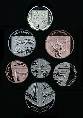
In seeking to spread a single design across six denominations, Matthew conceived an imaginative and clever solution new to British coinage. Individually the coins focus on details of the Shield of the Royal Arms but when placed together they reveal the complete shield. The result is a set of coins firmly rooted in the heraldic traditions of the British coinage yet beautifully contemporary.

Of his design, Matthew says, "The brief called for six designs to represent the United Kingdom. The idea of a united design in a jigsaw-style execution – choosing one subject to appear across the six coins – avoided any awkward emphasis on any particular countries and was a solution which I could see working. This approach seemed intriguing since I hadn't seen anything like this used in coin design before.

"The issue with this for me lay in their distribution; how to represent the whole of the United Kingdom over six coins. The idea of a landscape appealed to me; perhaps using well-known landscapes from different areas around the United Kingdom which could stretch off the edge of one coin onto another. This seemed like a good solution but I also wanted to look at other options and themes.

"The reason I settled on heraldry as a subject matter for this idea was ... the shield of the Royal Arms was a successful vehicle for the design in terms of its almost square-like mass. In practical terms, this meant that coins could be arranged above and below one another as well as to the left and right of one another – a much more satisfying result than had it been a linear arrangement."

It is not surprising then that Matthew chose the Royal Arms, or that the Royal Mint encouraged designers to do so. Virtually unchanged since the reign of Queen Victoria, the Royal Arms is a symbol of the Queen's authority over the whole of the United Kingdom, and has been used to powerful effect by numismatic artists over the course of her reign. The 
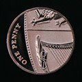
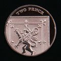
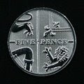
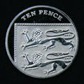
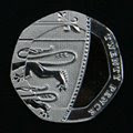
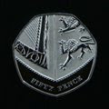
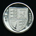
Royal Arms is divided into four parts: England being represented by the three lions passant guardant in the first and fourth quarters, the Scottish lion rampant in the second and the harp of Ireland in the third, with all four quarters spread over the six coins from the 1p to the 50p. Completing the new range of coins is the £1 coin featuring the shield of the Royal Arms in its entirety, uniting the six fragmented elements into one design.

"My initial excitement over this jigsaw style approach was that I could imagine the coins being played with, arranged and enjoyed in a way in which coinage hasn't been before. I could see their appeal to children, their interest to adults, and also I could imagine that I'd want to piece them together myself given half a chance. This 'interactive' aspect of the jigsaw idea is an exciting angle. Assimilating a design is a satisfying and empowering activity; choosing to create the design as intended or doing something completely different – it's up to you. Yes it's coinage, it's a practical medium, you can still buy your pint with it, but this approach gave coinage some scope to develop a different personality."

Britain's current coin designs will remain in circulation and as legal tender for the foreseeable future. They will continue to circulate alongside the new coins. It is normal practice for banks to order coins from the Royal Mint to satisfy public demand, which fluctuates over the course of the year. Therefore it is not possible to give an exact time when the coins will appear in peoples pockets. We just hope the coins are in circulation before our next visit. FB

Monday, May 5, 2008

Fun with Branding: The Domino's Pizza 'Noid vs. Flavor Flav

It's amazing that Domino's villanous, red suited Noid (created by Group 243 and animated by Will Vinton Studios) and rapper/clock aficionado Flavor Flav coexisted in the 1980s and early 1990s without this brand hybridization coming to light:

This is the sort of thing that happens when graphic designers have idle hands and an unhealthy affinity for trademark infringement. Enjoy! FB

Monday, April 28, 2008

A Rather Difficult Font Game

Think you are pretty good at identifying typefaces? We thought we were. But we were recently shamed by our 23/34 score on Kari Pätilä's Rather Difficult Font Game over at the Say It Ain't Slow blog.

Currently the game challenges you with 34 typefaces to identify but the word is out that this may soon expand to an even larger collection of fonts. For our part, every designer we know (well, aside from the habitually font-challenged HTML designers) has reveled in the game. And while your SAT test-taking skills will help you pare down the choices sometimes, ultimately you just need that instinctive ability to discern Rosewood from Copperplate.

As ILoveTypography commented, "this kind of game is more than fun. In attempting to identify type, our sensitivity to type — and our ability to see what distinguishes one typeface from another — is heightened; it’s akin to cultivating a nose for wine."

For our part, we tried the game a second time and crawled kicking and screaming up to 27/34. So much for our uncanny font-recognizing powers...

Play The Rather Difficult Font Game
(iPhone users even get their own flavor of the game)

Enjoy! FB

Monday, April 21, 2008

Custom (Hackable) Tees at CNN.com

A friend of ours, Carl London, recently brought a great new service to our attention: CNN recently launched a tool that enables users to purchase recent news article titles on t-shirts. This beta service was quietly released today with the sudden appearance of little shirt icons next to the video icons on their homepage.

But you better hurry because the wearable headlines are only available as long as the article is featured as latest news on CNN. Click on a title and you will see the headline on three different American Apparel shirts (gray, black or white), each priced at $15. Once you buy a shirt, you can even share it on Facebook.

"Just t-shirts?" you say (like those nay-sayers over at Wired). Maybe so, but we thinks it's one of the the most surprising, and enjoyable, recent online innovations from a major media outlet. And we're not alone in this opinion. At least one other blogger feels that CNN's new t-shirt service is "the most brilliant Web 2.0 initiative we've seen from stodgy old Time Warner since … since."

As fans of the news – funny news, most of all – we love the idea of people wearing headlines as personal statements (including the t-shirt at right which, we are assured, is a real headline that formerly read "ABC News ****** up the Pennsylvania debate"). But the opportunities for abuse inherent in the CNN t-shirt API open the door for humor even further. You can write their own t-shirt URL and create an "official" CNN tee that says anything you want (though the site appears to block the purchase of illegitimate and outdated headlines). FB

Postscript (4/22/2008, 4:09pm): Looks like CNN has already fixed the URL-hack. So much for my backdoor headline tees!)

Monday, April 14, 2008

The Cost of War – and of Reporting War

We've long had an interest in the way photography and visual editorials can affect the way the public perceives news and conflict. So we took special interest in the way the press and the public marked this past March's bittersweet anniversary of the Iraq War. Most remembrances and acknowledgments focused on the 3,990 American troops that have been killed, and 29,395 that have been wounded, in the five years since the coalition invasion. But the Reuters news agency's interactive project "Bearing Witness: Five Years of the Iraq War" expands on our collective remembrance by reminding us of the terrible cost also born by the press corps. This comprehensive and powerful visual compilation of the past five years of war in Iraq includes interviews, a multimedia gallery of photography, video, and fascinating information graphics that combine to put the conflict in a digestible and poignant context.

"Bearing Witness" represents the work of 16 still photographers and video from Reuters Television photojournalists. Most of these images are accessible through the website's "Timeline," a rich gallery of powerful images and a clearly-presented reconstruction of the milestone events of the war. Of the thousands of photographs shot covering the war in five years, the picture editing to bring this particular set of images together in essay in the timeline gallery is especially compelling, exceptionally strong.

Equally impactful, and much more succinct than the photographic timeline, are the project's information graphics. These series of maps and charts graphically chronicle the toll of the war – on the Iraqi people, the coalition and Iraqi militaries, and the international media.

"Iraq has been the most dangerous war in history for journalists," former Iraq bureau chief for Reuters Andrew Marshall says in the multimedia presentation's opening. "But I think it shows value of what we're doing ... covering the news in hostile places is a worthwhile thing, it can bring about change, it can inform the world, and it is worth us risking our lives." Thus, "Bearing Witness" is a fitting tribute to the photographers, camera persons, reporters, and support staff who work under incredibly difficult conditions in war zones. It also serves as a memorial to the 127 journalists – seven from Reuters – who lost their lives reporting on the war in Iraq.

"Bearing Witness" is something of a surprise, emanating as it does from a news service known more for its financial reporting than its war correspondence. But despite Reuters' relatively small investment in news reporting – less than 10% of the company's income comes from non-financial information and reportage – "Bearing Witness" is a welcome reminder that, through half a decade of war, a team of 100 Reuters correspondents, photographers, cameramen, and support staff have strived to bring the world news from the most dangerous country for the press. Worldwide, Reuters has more than 600 photographers and editors working across the globe and distributes up to 1500 pictures each day covering breaking news, features, entertainment, business and sport.

"Bearing Witness: Five Years of the Iraq War," is also the inaugural exhibition for the Idea Generation Gallery in London, running from April 9, 2008 to May 4, 2008. The exhibit stretches throughout two floors of the Gallery, bringing together war photography, video, and information graphics so as to form a narrative concerning the harrowing nature of frontline war journalism. Americans may be familiar with a number of indelible images in the exhibit, but there are other photos included in the show that will be less familiar to an audience habituated to the sanitized version of the Iraq war as presented by mainstream media outlets. FB

Monday, April 7, 2008

How the Right Font Can Make the Candidate

We love fonts – that's no secret. So we were thrilled when Newsweek recently ran an excellent article on the emerging role of fonts in celebrity marketing and campaign politics. Author Jessica Bennett points out that "America has developed a geeky obsession with fonts, the latest instance of our sophistication about design."

Alongside her discussion of Beyonce and Bjork's celebrity typography, Bennett asserts that the "Obama 'brand'...is the best crafted of any politician's in history." And while this is very likely an overstatement (once upon a time, we did "Like Ike," after all), it is an argument with certain merit. As her video interview with noted designer Roger Black reminds us, well executed fonts can communicate as much, or more, than the words they illustrate.

Steven Heller's recent piece about campaign typography in the New York Times echoes many of Bennett and Black's points. According to branding expert Brian Collins, interviewed for Heller's article, "type is language made visible. Senator Obama has been noted for his eloquence, so it's not surprising that someone so rhetorically gifted would understand how strong typography is and how it helps brings his words–and his campaign's message–to life."

Perhaps it is not too much, then, to suggest that Barack Obama's brand is the "best crafted" of any politician currently seeking the presidency. The Obama campaign has "used a single-minded visual strategy to deliver their campaign's message with greater consistency and, as a result, greater collective impact. The use of typography is the linchpin to the program." Thus, Black's humorous assertion that one might vote for a candidate based on their visual marketing – in much the same way one purchases a bottle of wine based on the design of its label – is a sly but poignant reminder that appearances matter. Just as many Americans turned their backs on a sweating Richard Nixon in favor of a handsome, polished John F. Kennedy for largely cosmetic reasons, so might many Americans, otherwise ignorant of the candidate's platforms, vote based on visual impressions. Many of us don't have time to watch debates, but we do have time to see posters and billboards, well designed or otherwise. And in the visual design debate, Obama is clearly leading the pack.

Read "Just Go To Helvetica" at Newsweek. FB

Monday, March 24, 2008

I Think Star Wars is Turning Japanese

StarWars.com's Expanded Universe blog recently showcased a number of scenes from the original Marvel comic and the much later Media Works magna editions of the original Star Wars trilogy. It reveals both a striking contrast in how different cultures approach the material in a graphically illustrated form and how different artists either suffered or benefited from a sophisticated familiarity with their subject. But in particular, the comparisons below demonstrate how a more flexible storytelling format can facilitate good narration, dramatic effect, and inventive visuals.

To some degree, it's unfair to lament Marvel's original adaptations of the Star Wars trilogy. Each comic was produced during each film's post-production period – meaning the artists had not seen the films and were working merely from the script with only some key photography and concept art to provide visual direction. But more significantly, and especially in comparison to a manga adaptation, Marvel's artists had to conform to the page count and printing standards of newsstand comics from 1977-1983. This meant that all the action of a Star Wars film had to be crammed into six issues (or, in the case of Return of the Jedi, a mere four).

Japanese manga, on the other hand, has a much more flexible format. Unlike American newstand comics, manga page counts can swell or constrict to accommodate a more deliberate and varied pace of storytelling. And since the manga adaptations were not released until 1997, their artists benefited from years of study and familiarly with the Star Wars films.

What follows is a sampling of the most striking juxtapositions of the Star Wars trilogy presented in Media Works 1997 manga adaptation and Marvel's original serial interpretations. Please note that the manga pages presented here are their original Japanese incarnation, with the action playing out right-to-left. When Dark Horse Comics translated the manga editions to English they flipped the imagery so that it read left-to-right. Scene descriptions are taken from StarWars.com.


The Cantina
Starting with the Episode IV adaptation from Hisao Tamaki, the manga edition definitely benefits from the cantina being a much better researched environment. Offering up a whole page for Luke and the reader to explore the darkened corners of the bar lets the artist populate it with many more familiar faces. The devil-faced Labria is there, as is the band, the side-burn sporting rockabilly spacer BoShek, the snooty looking smoker Dannik Jerriko, and a rather fetching rendering of the Tonnika twins.


Conversely, the Marvel version has to condense its cantina introduction into a single panel. From the imagery in this and the background elsewhere in the comic, it seems likely artist Howard Chaykin was only given reference stills of the aliens assembled on set in England, and not the aliens shot during pickup photography -- so no Hammerhead, no Bith band, and no devil-face.


Han's Run-in with the Stormtroopers
The Japanese version of Han's run-in with stormtroopers aboard the Death Star really plays up the comedic angle of this scene. The exaggerated wild takes and flop sweat on Chewbacca, the cry of Han's battle charge curving down the corridor, Luke's half-lidded boredom with Han's antics, and the shoulder-to-shoulder countercharge by about 17 stormtroopers crammed into one panel are all for laughs.


The US Marvel version plays it more straight, and because the action is distilled to only six panels, Han's dialogue has to explain what's happening in the scene.


The Death of Obi-Wan Kenobi
A very graphical convention encountered time and again in the manga adaptations is the complete absence of backgrounds when a dramatic moment demands all attention to the foreground. When Obi-Wan sacrifices himself to Vader's blade, the moment takes place against stark white, so as to leave little doubt as to what happened.


The American version has to have the action of Kenobi's disappearance occur in only two panels, so it makes the most of it by having an extremely dramatic frame of Vader's strike, followed by Roy Thomas' descriptive text further detailing what has just occurred.


The Destruction of Alderaan
This is truly a stunner. First, the US version, which contains the destruction of Alderaan in a single panel.


Now, the manga version, which turns Alderaan's death into a real show-stopper, stretching it out to ten whopping pages. Across these five two-page spreads, we see ground zero on the surface of Alderaan and a stunned crowd scene as a blinding light flashes down from the heavens. We cut to Leia's anguished reaction before the planet finally vanishes in an enormous explosion that turns the Death Star into a tiny silhouette.


For more examples, visit StarWars.com. FB