It was a total fluke that we found the Huntly frontispiece in the first place. Some American friends of mine and I were traveling back to St. Andrews after a weekend in the highlands when the train taking us south stopped at Huntly. For no reason other than having none, we jumped off.
At length we found the castle — for all practical purposes, our destination. It was certainly one of the most impressive we'd seen in a while, if not the best preserved. We explored and hunted. A chance glance behind as we exited the keep showed us the real treasure at Huntly castle.
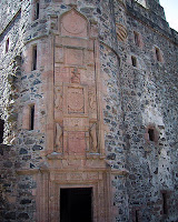
The frontispiece – architecturally, an ornate carving over a door or window – was two stories of impressive medieval thought carved into stone. I was so intrigued by it that it eventually made its way into my totally unrelated thesis fourteen months later.
From bottom to top it shows to relative position of the local marquis in the hierarchical system of feudal lordship. Casual medieval passersby – even the notoriously illiterate Scottish ones – would have been able to easily decipher the successive diagram. I'll break it down for my twenty-first century contemporaries:

Starting at the bottom, we have a composite coronet and coat of arms, supported by a Huntly deer-hound on the left and a Lennox wolf on the right, identifying the marquis George Gordon of Huntly and his wife Henrietta Stewart of Lennox. Above the coat are their respected family mottos and below are their initials. This is the lowest level of this feudal display; anything lower was, unfortunately, considered irrelevant ("bloody peasants!").
Above the local lord we have the royal arms of Scotland supported by a Scottish unicorn on the left and a Danish Wyvern of the right. Atop the coat, the royal crown is straddled by the crucified St Andrew and flanked by the initials IR6 (King James VI) on the left, ARS (his Danish queen, Anna) on the right, and the royal motto above.
Above the king – if you can imagine such a thing – is the wounded Christ in His Passion supported by St Mary and St John. Over these three figures read a scriptural quote. These biblical characters, defaced on this frontispiece in 1643, were a literal reference Christ of the crucifixion, the mortal son of God.
And lastly, atop the whole hierarchy, is Christ as glory, within a circle, proclaiming his resurrection. Jesus is flanked by the Scottish lion on the left, the two-headed eagle of the Holy Roman Empire on the right, and a triumphant archangel Michael overhead. These characters, likewise defaced by the overzealous Covenanters, served to represent the eternal God – the resurrected Christ become Lord.
And so we can quickly summarize the humble place the marquis Huntly saw himself: Marquis-King-Christ-God. I imagine it pleased lord Huntly quite well to consider his place in this hierarchy and realize that his only temporal superior, after all, was a King over a hundred miles away.
But from a communication designer's point of view, the frontispiece masterly communicates it's message to its target audience. The use of heraldic and symbolic panels suited the illiterate populous of the day, peasant and noble alike. The sparse use of letters rounded out the message, for those educated enough to understand them, but was not necessary for the understanding of the hierarchical theme (literacy was the medieval flash-plug-in of it's day – you could never count on the casual browsers having it).
Straight from 1602 to 2002. As clear as day, if you know how to read it. I very much doubt the same clarity will be had for the PowerPoint presentations our 400-year decedents discover among our ancient belongings.
fb


 Jacob Nielsen, the unofficial web usability guru, has his fans and his critics. While I do sympathize with Nielsen's love of rules and order, I'll be the first to admit that I disagree with his almost draconian insistence on their universal application. That being said, his and Marie Tahir's recent book Homepage Usability: 50 Websites Deconstructed, gives us a whopping 113 usability rules to consider as they break down 50 of our most popular and oft-visited website homepages.


