Thursday, July 1, 2010

The جديد Neue Helvetica

I was thrilled recently to come across Nadine Chahine's article on ilovetypography.com touting her new Linotype type face, Neue Helvetica Arabic.


Nadine has already given us Arabic interpretations of Frutiger and Palatino (the later of which, developed with Hermann Zapf, won the Certificate of Excellence in Type Design from the TDC). And I say interpretations because, as Chahine notes herself, "One would think that all one has to do is to import the curves of the Latin into the Arabic script structure and the work is practically done. This is not the case."

I've tackled a few bilingual logos and the process of adapting a Latin-service typeface to suit Arabic letter shapes is more than just matching weights, curves, and the oft-tragic transplantation of serifs. Chahine describes the interpretive process, saying, "Look at what Neue Helvetica does as a typeface, how it functions, what visual message does it carry, and then see how to achieve that function and message in Arabic. It is not about how similar the curves are, but how similar the typefaces function. This is at the heart of multi-script type design .... how would you translate an iconic design into a script that defies neutrality? Is this even possible? To make things more complicated, Arabic calligraphic styles are many and some are more suited for headlines, others for text. Helvetica functions on both platforms so the Arabic needs to do so as well."
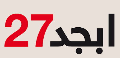


This is a tremendous addition to designers working in Arabic script. And while the face is currently only available in three weights—Light, Regular, and Bold—I'm hoping the wide variety of neue weights we've become accustomed to in Latin script follows soon in Arabic.

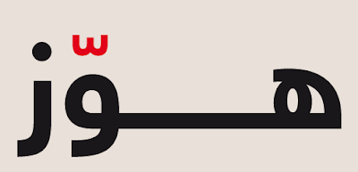
Oh, and on a purely personal note, I love that Chahine's sample images are the Arabic equivalent or lorem lpsum (ابجد هوّز). FB
Wednesday, January 13, 2010

Ink is Light, Paper is Photography, Calligraphy Becomes Choreography

Our affinity of Arabic calligraphy recently led us to the work of Julien Breton (aka Kalaam), a French artist whose light calligraphy takes the look of modern Arabic calligraphy and sets it, through time lapse photography, in front of dramatic backdrops. And while not authentic Arabic calligraphy–Breton uses an original Latin-based alphabet in a semetic style–his technique both evokes the best of modern Arabic calligraphists, such as Hassan Massoudy, Western graffiti and digital arts. And the best part, Breton's images are made without digital special effects.

According to Breton, "The principle is simple: The camera, placed on a tripod, takes a photograph in a 'Big Break.' This means that photography can last from 30 seconds to several tens of minutes depending on the brightness of the place. The same principle used by photographers to photograph the streaks of headlights of cars. During this long pause, I build calligraphy using lamps of different shapes and color, using the setting as 'a backdrop.'"

Breton's light calligraphy requires not only calligraphy skills but also a full range of body language, choreography, and hi-tech exchanges with photographers and video artists. But through patience and skill, Breton and his collaborators can turn almost any backdrop into a canvas, from beautiful landscapes and historic monuments to the sides of buildings or the bare-skinned backs of models in pose. And since early 2009, Breton has worked with Digital Slaves to develop a new process for creating real-time virtual calligraphy.

Enjoy a few samples of Julien Breton's light calligraphy below. And if you're interested in learning more, check out an interview with him about light- and virtual-calligraphy at Ziggy Nixon's blog.


See more examples at Julien Breton's website. FB

Tuesday, January 5, 2010

Bilingual Rebranding

Batelco—the Bahrain Telecommunications Company—is the largest provider of internet, mobile and telephone services in Bahrain, partly because until recently it was a monopoly. And, as first reported on Brand New, Batelco recently updated its identity to reflect both its lead position in a new competitive market and its bilingual reality.

The previous logo was remarkably dull and generic—though perhaps expected for a government-run organization. It also demonstrates some of the typographic limitations that limited multi-lingual works on the English/Arabic divide before the recent explosion of semitic language typefaces.

The previous logo (left) and the new logo (right)


The new logo, in contrast, is remarkably strong and memorable. According to Futurebrand, the designers of this new identity campaign, Batelco's logo evokes "the idea of what you can 'be' with Batelco. Our new identity celebrates Batelco as a Bahraini icon, linking us in colour and with the letter B to our country. The bilingual logo, which reads as both an English and Arabic letter B, also resembles an infinity sign, further communicating Batelco's omnipresence throughout Bahrain."

Additionally, we love that the logo's shape is clearly evocative of the island country's shape, including the Hawar Islands off the southeast coast.

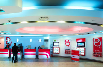
Have a look at the new logo in the wild. FB


(ref: Brand New "To Batelco and Beyond")