Wednesday, January 5, 2005

Cloudjammer's 2005 playlist

At Cloudjammer, we keep the music playing all day long – you've probably heard the rhythms behind each phone call to our offices. We beat away the silence with a wide variety of the best music available – from classic tunes by Old Blue Eyes and the great Band Leaders to classic rock and the newest indie, brit rock, and hip hop on the market.

Sample some of the music on the studio's playlist – from perennial favorites to this season's newest additions. If you like what you hear, jump off to iTunes or Amazon and flesh out your own library.

Listen to samples from this issue's playlist

Happy listening! fb

Erykah Badu "I Want You"
from the album "Worldwide Underground"
Browse Erykah Badu on iTunes | Listen...
A long, layered, track that feels more like a jam session than a polished single – it might be the best makeout song we've heard in years.


Cary Brothers "Blue Eyes"
from the EP "All The Rage"
Buy this song on iTunes | Listen...
One of Apple's Top Ten Folk Songs of 2004, this track rocketed onto our radar from the "Garden State" soundtrack – great to sing along with.


Getz/Gilberto "The Girl from Ipanema"
from the album "Getz / Gilberto"
Buy this song on iTunes | Listen...
From one of the best-selling jazz albums ever
comes one of the biggest jazz singles of all time.
Liberate it from Muzak!


Origa "Inner Universe (Ghost In The Shell)"
from the soundtrack to "Stand Alone Complex"
Buy this album at Amazon.com | Listen...
A Russian/English lyric on a strong electric beat form this great title track from the anime Ghost in the Shell: Stand Alone Complex.


Kasabian "Club Foot"
from the album "Kasabian"
Buy this song on iTunes | Listen...
These self-styled saviors of music have produced the most refreshing Brit-rock track since Blur's "Song 2" or Travis' "Blue Flashing Light".


M83 "Run Into Flowers (Midnight F*ck Mix)"
from the album "Dead Cities, Red Seas & Lost Ghosts"
Buy this song on iTunes | Listen...
This French duo delightfully lace intense and tender electronic styles with hushed vocals to create an addictive electronic medley.


Stan Rogers "Barrett's Privateers"
from the album "Between the Breaks...Live!"
Buy this album at Amazon.com | Listen...
The live (1979) and definitive version of this seaman's dirge about Canada's war against the US during the 1776 revolution. Argh!


The Shins "The Past And Pending"
from the album "Oh, Inverted World"
Buy this song on iTunes | Listen...
Our favorite album of the last 6-months, it was hard to sample just one track for this list. Get the whole album – it's that simple.


Thievery Corporation "Lebanese Blonde"
from the album "The Mirror Conspiracy"
Buy this song on iTunes | Listen...
A stylish and easy groove complete with sitar, Jamaican-style horns, sexy vocals, and sublime
mid-tempo beats.


UNKLE "What Are You To Me?"
from the album Never, Never, Land
Buy this song on iTunes | Listen...
The UNKLE trio's wide-scope epic trip-hop features great vocals and rolling digital music, reminiscent of Dirty Vegas.

Battleship!

To inaugurate the interactive section of Fight.Boredom, we took a look back at the seminal games of our youth. While Hungry Hungry Hippos and Chutes and Ladders proved stiff competition, Battleship proved the most playable for desktop adaptation.

First adapted from a pencil and paper game into Milton Bradley's popular iconic guessing game, we now take our turn, transforming Battleship into a colorful desktop challenge. We've added more ships and more squares to make the game more challenging but have strived to keep the look and feel of the classic game intact (complete with white and red pegs – but these are no choking hazard. Play against the computer and sink Boredom's fleet before it can find your ships. So minimize that word doc, close your email, and take a few minutes to enjoy this small amusement in the arsenal against boredom. fb

Launch Battleship!

Errata: A Few Items To Brighten Your Day

Bits and pieces often fall through the proverbial cracks... but we just can't let them be. Take a look at this issue's errata – we hope you enjoy them just as much as we do.

Adopt a GI, online
We recently contributed to the war effort – beef jerky, hard candy, paperback books, magazines, bath products, and girl scout cookies. We answered the call on AnySoldier.com, a site that puts soldiers in need of supplies (or even just a letter or postcard) in touch with supportive benefactors on the home front. Our package took about two weeks to get to Iraq and the soldier we sent it to responded by email to let us know how appreciated the effort was: "thanks for the box ... it made all of our days ... the women i work with really liked the bath stuff and I love the books and razors and the snacks. Thank you."

AnySoldier was started in August 2003 by Sergeant Brian Horn from LaPlata, Maryland as a simple family effort to help the soldiers in one Army unit. Due to overwhelming requests, on January 1, 2004 AnySoldier.com expanded its services to include any member, of any of the US Armed Services in harm's way. Horn was serving with the 173rd Airborne Brigade in the Kirkuk area of Iraq when he started to distribute packages that came to him addressed "Attn: Any Soldier" to the soldiers who were not getting mail.

As of this writing, Horn is serving in Afghanistan but AnySoldier continues to help the men and women in khaki worldwide – 114,667 to date. Adopt your own GI, today. fb

Custom M&Ms! Too good to be true!
As if M&Ms weren't good enough to begin with (their overwhelming Star Wars tie-in aside), the Mars candy company now invites customers to create their own personalized M&Ms at shop.mms.com.

In addition to a number of other custom M&M options, you can write your own message on the classic candies. Choose from 21 different colors and print messages on your very own candy mix. While your message is limited to two short lines or eight characters each (how much text could we honestly expect to squeeze onto such a tiny morsel) and individual orders can only include one or two colors, the prices and packaging options are surprisingly fair (though not exactly cheap). An standard 8oz bag (4 bag minimum order) sells for $9.49 a bag while a number of "party favor" options round out the selection, including a stylish silver tin (20 tin minimum order) selling for $4.25 apiece.

We were most excited to see the bright orange M&M color available.. and, wouldn't you know it, "Fight Boredom" fits perfectly in the two line scheme. If we don't eat them all ourselves, maybe you'll see a bag or two. fb

National Geographic's Genographic Project
National Geographic and IBM have begun a five-year study to assemble the world's largest collection of DNA samples to map how humankind populated the planet. This Genographic Project will result in the creation of a global database of human genetic variation and associated anthropological data (language, social customs, etc.) that will fill the anthropological gap between humankind's African origins and its worldwide distribution.

With a simple and painless cheek swab kit (and $99) you can sample your own DNA, submit it to the projects secure, private, and completely anonymous system, then log on to the project Web site to track your personal results online. This is not a genealogy test and you won't learn about your great grandparents, but you will learn of your deep ancestry, the ancient genetic journeys and physical travels of your distant relatives. Also, you will be contributing financially to the project.

The price might seem steep for a cheek swab, but the project's effort is laudable and, much more to our point, fun. fb

Firefox Shakes Up The Net

Like most Internet users, I had never given much thought to the browser I surfed with. I was perfectly happy with Microsoft’s Internet Explorer. It’s just a browser, right? All it needs to do is display websites for me. But recent Internet Explorer security scares made me think twice about this. I switched to Mozilla’s Firefox, and haven’t looked back.

Firefox is an Internet browser developed by the Mozilla Foundation, a California-based non-profit organization dedicated to developing open source software. Released on November 9, 2004, it has proven to be a popular alternative to Microsoft’s Internet Explorer.

Firefox offers many features that make it superior to Internet Explorer – added security is perhaps the most important. Explorer is tightly integrated with the Windows operating system. The browser has vulnerabilities that allow outsiders to get access to your computer. Firefox, designed with security in mind, features a comprehensive set of privacy tools. For example, most spyware is blocked because Firefox does not load harmful ActiveX controls.

But there are many other great features to this browser. Firefox offers a brilliant innovation in surfing called “tabbed browsing.” This allows you to display several web pages in a single window, which you can switch back and forth between by clicking on tabs. There are also many extensions available for download. These include everything from toolbar buttons to a Homeland Security monitor that keeps users aware of current threat levels. A pop-up blocker comes built in. While a pop-up ad will still get through every now and then, it is still better than the buggy third-party software you have to use with Explorer. Firefox makes downloading files over the Net easy since it automatically saves them to your desktop (you can change this setting if you want). No more hunting for the buried folder Explorer randomly chose to save your file in. Finally, Firefox is open source, so any programmer can examine and improve it. According to Mozilla director of engineering Chris Hofmann, “Open source projects have a much higher standard. It’s the engineers that actually build the software that label when it’s done.”

As of this writing, more than 50 million people have downloaded Firefox or its updates. The browser is slowly eating away at Internet Explorer’s dominance. According to OneStat.com, the proportion of surfers using Explorer has dropped to below 90%. As Mozilla Foundation president Mitchell Baker puts it, “People had come to think that browsers didn't matter, but if you have a better one, the whole way you browse the Web is more pleasant.”

Switching is quick, easy, and (best of all) free at Firefox's website. Firefox even imports your bookmarks, your history, and your passwords from Internet Explorer. Try it. I promise you won’t ever use Explorer again. fb

SCAD Comes to Atlanta

The art education community in Atlanta just got a little bit ... scarier.

It was February, just a month before the Savannah College of Art and Design (SCAD) was scheduled to open their new Atlanta campus, when a curious letter appeared in my academic mailbox. My status as a member of the adjunct faculty of the Atlanta College of Art had earned me SCAD's indiscriminate attention. I, and nearly every colleague of mine in metro-Atlanta education, received a blanket solicitation – an invitation to join SCAD's new Atlanta faculty. Chills ran down my spine.

The Savannah College of Art and Design was founded in Savannah, Georgia, in 1978, and awards Bachelor of Fine Arts, Master of Architecture, Master of Arts and Master of Fine Arts degrees, and both undergraduate and graduate certificates. Since March 2005, SCAD-Atlanta has provided undergraduate and graduate education in art and design, with initial course offerings including animation, art history, broadcast design and motion graphics, drawing, illustration, and painting. The school expected more than 100 students to take classes in Atlanta starting Spring 2005, including current SCAD-Savannah students who moved north with nearly a dozen faculty and their programs.

SCAD began developing a relationship with the Atlanta community and business leaders in 2003 with the opening of "Savannah," a contemporary art gallery in Buckhead. Atlanta is also home to approximately 700 SCAD alumni.

Downtown Atlanta business leaders had hoped SCAD would select the abandoned Macy's building at 180 Peachtree, vacant since the department store closed in April 2003. Other potential sites had included the Equifax building, the Inforum, Centergy in Midtown, Two Buckhead Plaza, and locations outside the Perimeter.

Instead, the college selected 1600 Peachtree, formerly occupied by iXL, a Web design company that invested more than $21 million in renovations. Miami-based design firm Arquitectonica used bright colors and innovative lighting techniques to create a unique interior environment for the metropolitan campus. The facility features well-equipped classrooms and computer labs, studios, a library, administrative and exhibition space, a fitness center, dining facilities, parking, and a nearby residence hall.

So what about SCAD caused my hair to stand on end? Its reputation. I had been teaching at ACA for several semesters, and had guest-lectured several times at the nearby Creative Circus, before that letter showed up in my mailbox. More than a few of my students were "SCAD refugees" and a number of my faculty peers had "done time" in Savannah.

Rumors had been floating around art and design circles for a while about SCAD's uneasy relationship with Atlanta education institutions. Georgia State and Georgia Tech had reportedly declined to share facilities and programs with the art school. Even the current standing of SCAD's accreditation was in question.

Curious, I began to do my own informal research. Indeed, around the time the letter showed up, I had become aware of a lively online community of SCAD detractors – including current and former faculty.

With a grain of salt, I learned about SCAD-Savannah's academic and administrative culture – an environment repeatedly likened to John Grisham's The Firm. The overall theme was one of abuse – both academic and physical. Stories ranged from professors fired for "disloyalty" and "giving voice to student concerns" to the use of physical force to make departing faculty sign releases and waivers. There was even documentation of a rash of faculty who become ill, developed cancer, and died while working in the Savannah campus' Poetter Hall (The Atlanta Journal - Constitution, Sunday, July 20, 2003). Tales of physical coercion and mob tactics fill faculty testimonials. Tales of inadequate facilities and incompetent administration fill student and parent critiques.

I fully appreciate the venom one can have for their former employer (just get me started on my former studio if you don't believe me) but the frequency of similar complaints and the nature of some of them – especially the physical assaults and instances of legal misdirection – shocked me. Could so many people bear such rancor without reason?

SCAD's track record with job openings is perhaps a less easily disputed measure of their success with faculty. The same openings appear time and time again, either never filled or always needing replacement. When I asked a colleague of mine about this he smiled and advised me, "Avoid SCAD, whatever you do. They use professors up and throw them away. You'd be lucky to get out with your reputation intact. They ruin people."

The Savannah College of Art and Design is the largest educational institution of it's kind in the South East. Already other area institutions, most notably the Art Institute of Atlanta, are adapting their course offerings to compete with SCAD's Atlanta campus. And the rumors and accusations continue to fly.

And now they're here. fb

FrontPage Sucks

"FrontPage Sucks."

That is what I wanted my article to be – just that one statement – but no one here at Fight.Boredom would let me get off that easy (even though they all agreed with the aforementioned statement). They said I needed something called "content" – whatever that is. So I decided to do a little research and refresh my memory about that cruel little program, Microsoft Frontpage.

I was initially very surprised with what I found online about FrontPage; the reviews my searches turned up were generally complimentary. Very complimentary, even. I must say, I was a little shocked and surprised with this – my hatred for Frontpage runs deep and has festered for a long time. These reviewers were talking about how easy it was to use and how simply you could put a webpage together. They loved it!

Then it hit me – the trend connecting all of these supporters. They all had no idea what they were doing.

This is Frontpage's market (and the real reason this article was written). Frontpage has very successfully gone after the user with little to no experience and offered them an HTML editor at half the price of the competition. We are talking about people who never knew of or even saw HTML before Frontpage – and likely know nothing of it afterward. The Frontpage marketing team is calling up small businesses and offering them a chance at a website that they might not have gotten otherwise.

Now you say "What is wrong with that?" and imply that we might just be horrible web design snobs...

The only answer I can give is "Nothing. There is nothing at all wrong with FrontPage or its target market."

It is better for most businesses and organizations to have some web presence rather than none (though it would be much better if that web presence was well built and maintained, design aside). But virgin webmasters really should do a little research before making that Microsoft purchase. You would hopefully discover some of FrontPage's major deficiencies: for instance, the junk code that FrontPage inserts and how it leaves code in after the relevant content was deleted in the editor, a situation that renders disproportionately large webpages. Unless you know HTML, the only way to optimize FrontPage web pages is usually starting over from scratch.

In my own experience, I've found Frontpage sluggish and cumbersome, even ignoring the junk code issue. It is often easier to recreate a table or just change the HTML of a table then use the user-friendly editor. It came to the point where I was typing out the HTML more then using the editor! Then I was shown the glory of Macromedia Dreamweaver and I was blown away. It was clean, efficient to use... and $200 more... but it wrote no more junk code and even provided a tool to clean up the junk code that Frontpage had left in it.

It was then that I truly realized, Frontpage sucks. fb

The Doldrums

What Are The Doldrums?Fight.Boredom's Doldrums is the Internet’s newest competition for badly designed, poorly written, unnavigable, unmarketable, and boring websites. Reflecting more than just the tremendous growth of the Internet as a tool for business and communication, the Doldrums explore the unpleasant and unintelligible reality of the web and web design.

This year's winning sites are more than just ugly sites – they represent the very worst of the Web. The winning sites have no excuse for bad interactive design – corporate websites with impossible navigation and endless, incomprehensible business-speak; horribly designed web-based service sites with unusable features; and overwhelming high-bandwidth tragedies so ill-conceived that their very existence should be called into question.

We placed a call for entries and you responded in kind: You sent us your boring, your ill conceived, your poorly executed. You sent us your disasters, your train-wrecks, your blatant knock-offs. You submitted the sites that won the inaugural Fight.Boredom Doldrums!

Why did we do this? To point out those critical errors which ruin websites and cripple e-commerce. Fight.Boredom’s editors, staff, and judges have critiqued each winning site – noting both their failings and recommending design solutions. Winning websites were selected, from among the publicly-submitted address by a panel of graphic artists, web designers, business content writers, and digital art educators. Any interactive project created for digital distribution on the World Wide Web was eligible.


Judgment Criteria
Our judges were asked to measure submitted websites by the following criteria:

  • Design. How good is the site's visualization and graphic design? Is it over- or under-whelming? Is it appropriate?
  • Navigation. Is the site easily navigable? Does the navigation make sense? Is it consistently applied?
  • Usability. How long does the site take to download? Are there significant browser compatibility issues? Broken links? Distracting sounds?
  • Understandability. Does the site and its descriptive language make sense? Can you tell what the site is for? What they do?
  • Stickiness. Do you want to stay on the site? Do you want to go back to it later?
  • Irony. Keeping in mind what the site is promoting, how well do they do it? Does the site contradict itself or its stated purpose?


First Place: Kevin & Kennedy Associates
Sins: Design, Navigation, Usability, Understandability, Irony
Visit the website and judge for yourself...

The very worst of this year's worst – the winner of 2005 Doldrums is the website of Indianapolis-based Kevin Kennedy & Associates!

Take a lesson from this website's bevy of mistakes so you can spot these mistakes before they are made on your website.

Design
"Get your pre-generated website here!" cried one judge on viewing Kevin & Kennedy Associates. Many of this site's critical failures stem from weak, seemingly "out-of-the-box" graphic design. If not drawn from an inexpensive template, than the site certainly looks like it is.

The website manages to be both over- and underwhelming at the same time. The variety of clashing colors and gratuitous visual effects (namely the distracting radial gradient inside most buttons and the shadowed bevel effect applied inconsistently throughout the website) change a simple left-hand-navigation layout into a visually nauseating graphic experience. This is a common mistake online – the vain and rarely successful effort to make a website "spiffy".

Navigation
The navigation on the Kevin and Kennedy Associates website is a total mess. One of the most common remarks made by the Doldrums' judges was in regard to the cobbled together navigation running along the top of the site and stacked on the left. While the positioning of the navigation would be familiar to most web users, there are no visual cues delineating different categories of links from one another – their position and graphic treatment appear random.

And there are simply too many links taking up too much room, all down the length of the page. In fact, the only positive feature of the site's navigation that comes to mind is the presence of the "Back to Top" button at the bottom of most pages – a necessary addition to pages which take so very long to scroll down through.

Usability & Understandability
This site has too much content – it took one judge 36 rolls of their mouse's scroll wheel to navigate down the full length of the homepage!

Upon arrival, it is very difficult to determine two important features of the site: What does this company do and which links are the ones of most importance to me?

One judge reacted with particular frustration, saying of the site: "[There is] too much text. Client listings aren't the same as client references. Then links within links. You get a page of text that tells you nothing and then a new slew of links that hop you all over. In the end you still know nothing."

Indeed, commented another viewer, "It seems the content of the site was designed more for search engines than for user consumption. I have no idea what much of the site was either talking about or linking to – and I'm certainly not going to follow a vague link to who-knows-where."

Perhaps most critically, contact information is placed well below the fold – the vertical span of a standard computer screen. Either below the left-hand navigation or at the bottom of the page, contact information, especially the phone number, is hard to find and not readily copy-able. This is both poor design and, to some of our judges, suspicious.

Irony
The combination of poor design elements, overflowing content, and incomprehensible navigation creates an environment on the Kevin & Kennedy Associates webpage to which one Doldrums judge reacted: "This site does not say 'trustworthy engineer' to me. It says 'scam to take your money'. I'd jump as soon as it loaded."

How to Fix this Website
Redesign and rewrite the site with the web in mind – and with the user in mind, not search engines. One judge suggested: "Way too much content, but that was to be expected. It's a 'Jack of all trades' site. Overwhelming content. Recommendation: Less is best, especially on a website, and tell it to me like I'm 5 years old. Keep it simple. My ears popped from the pressure of scrolling down that far in content. "

Content needs to be minimized and streamlined to the most critical points, at least on the homepage and other introductory pages. The navigation should be reduced and clearly organized, allowing the website's users to more intelligently select their path through the website.

Remember: If your website's users don't find what they're looking for in the first few seconds of their visit, they will likely leave. And with good reason. fb


Second Place: CapturePlanning.com
Sins: Design, Usability, Understandability, Irony
Visit the website and judge for yourself...

The 2005 Doldrums' second place winner – a planning website that proves the importance of such basic planning activities as proofreading and browser compatability review.

Take a lesson from this website's bevy of mistakes so you can spot these mistakes before they are made on your website.

Design & Usability
While one judge applauded the CapturePlanning layout for attempting to manage its large volume of content with columns and a structured layout, several other judges found issues with the site's tiny typography. One judge explained: "The font is minuscule and frankly if I were browsing I'd be moving right along to another provider. I'm 30 with good vision. I shouldn't need a magnifying glass to read the page."

This website's text display represents a massive platform conflict – a radically different appearance on PC and Mac broswers. Indeed, one Doldrums' judge experienced this conflict between different browsers on the same PC. CapturePlanning makes use of cascading stylesheets using non-standard fonts and variable font-sizes, rendering the website's text differently for each user (relative to a user's installed fonts and screen settings). This creates a highly variable user experience. To prove this point, while many of our judges complained about the tiny text sizes on this site, one complained of their enormity!

Understandability
Like the Kevin & Kennedy Associates website, the CapturePlanning suffers from a lack of content direction and brevity. One judge commented on this issue, saying: "This site looks like they took every thought they ever had and threw it at the front page."

They went on to add: "[CapturePlanning] is just like every confused business owner I've ever dealt with – give the user everything so they are too confused to realize that you really don't know what you are talking about. There is no succinct message – it's bland, boring, overloaded, and ineffectual!" In frustration with the site's meandering content, another judge added, "Ever heard of planning? Being direct? Hello?"

What's worse, the site is replete with grammatical errors and omissions. "It appears they haven't edited the site – in places words are missing entirely or text formatting doesn't turn off when its clearly done being needed."

Irony
The rambling nature of the site's content stands in ironic contrast to the site's stated purpose and marketed literature. One of the Doldrums' judges described this situation: "I think the site has more content than a lot of the books they’re selling."

How to Fix this Website
The CapturePlanning does do some things right – their top navigation is easily expandable and worked in all tested browsers. Additionally, the homepage does make a concerted effort to describe the purpose of the website.

Browser conflicts in the text, however, need to be cleaned up and the appearance of the site needs to be more specifically defined. This could be as simple a fix as defining font sizes as pixel heights in the existing website stylesheets – the fundamental design of the website is not actually flawed. Type sizes need to be large enough to be legible by any user, regardless of their age.

Also, as we witnessed on the Kevin & Kennedy Associates website, the CapturePlanning website suffers most of all from a lack of focus in the text. Content needs to be minimized and streamlined to the most critical points, at least on the homepage and other introductory pages. fb


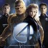
Third Place: Fantastic 4 Movie
Sins: Design, Navigation, Usability, Stickiness
Visit the website and judge for yourself...

The 2005 Doldrums' third place winner – a surprising dark horse right out of Hollywood that found the unanimous ire of our judges.

Take a lesson from this website's bevy of mistakes so you can spot these mistakes before they are made on your website.

Design
This is a visually stunning website, no question about it. It makes great use of production and film photography and attempts to capture some of the comic book feel defined by other film sites, such as those for the X-Men movies. But the overall sensation is of a site unfinished, or, at the very least, thrown together. Uncoordinated navigation elements create an effect one judge described as a "Fantastic flop. I think they ran out of money when this was being created."

Content areas are often small, as well as the image and text content contained therein – an inexplicable aspect of the site given the long load times throughout the website. Indeed, some of the most prominent design features are the loading bars themselves.

Navigation & Usability
Loading issues represent the greatest sin on the Fantastic 4 website (a debate among the judges about the merits of Jessica Alba as an actress, aside). In combination with inconsistent and sometimes difficult-to-use navigation, this renders the website clunky and hard to use.

"What precisely does 'Oading" mean?' asked one Doldrums judge. "Sometimes the flying flashing bubbles say "loading" other times "oading". After having to chase the flying bubbles of information for a while I got irritated and left."

"Initially I was thinking 'why is this so bad? It's just your average super hero movie site. But it lost me as soon as the flying and the flashing and the slow loading and tiny text and and and..."

Stickiness
While Hollywood websites are often prone to frequent updates to drive traffic back, over and over again, the difficulty in finding this new content and the long load times required to access it inhibit repeat visitation – long load times for various areas of content, even across broadband connections, discouraged all of our judges from revisiting the site except for judging!

Faster loading film sites with a more transparent navigation (the films sites for Star Wars and Hitchhiker's Guide to the Galaxy being recent examples) present much more enjoyable user experiences with less waiting and more interaction.

How to Fix this Website
Optimize, optimize, optimize. A website’s download speed can make or break it. Even without adding a low bandwidth non-Flash alternative – which this site absolutely should have – efforts should be made to trim the overall load times. Consider the Death-to-Download ratio (issue 2003.01), which measure load times in terms of global deaths/second statistics: 29 people died while I waited to access the Fantastic 4 website's homepage across my office's DSL connection! fb


Honorable Mentions
Could we really limit ourselves to just three lemons? Here are a few of the "also-rans" that were just so bad we couldn't exclude them from this year's Doldrums

Celtic Insurance
InterNIC
Perpetual Systems
TopGallant Partners
Toys for Tots


The Judges
Fight.Boredom enlisted creative professionals representing various disciplines to judge the 2005 Doldrums
  • Hal Greer, Greer Creative. Hal has extensive illustration, design, and brand experience working for a wide range of clients, from Big Five firm's to nationwide corporations and non-profits of all sizes. His design work has been widely recognized, resulting in more than a dozen awards from the Central New York Ad Club and AIGA regional chapters.
  • Kristyn McGeehan, Wordsmith Creations. Kristyn is a business and technical writer specializing in commercial writing and designing both classroom and online training materials.
  • Patrick Greer and J.D. Jordan, Cloudjammer Studio. J.D. and Patrick have extensive experience in interactive media and graphic design, specializing in creative services for the Internet. They have taught college-level courses in electronic and Internet art, and have judged a succession of student Internet design competitions. fb