I’m a sucker for good typography and Latin-Arabic crossover work—as the last several posts no doubt attest. But I’m not the only one, turns out. The folks over at
Brand New recently awarded the
Mathaf: Arab Museum of Modern Art the title of
best comprehensive identity program and best in show.
Mathaf, Arab Museum of Modern Art (
mathaf, متحف,
is Arabic for museum, pronounced mat-haf) is a new modern art museum in Doha, Qatar. Its mission is to "showcase modern and contemporary art from the region, shifting existing perceptions of arts practice in the Arab world, and provide a forum for dialogue and scholarship." The award-winning branding program was handled by the Dubai office of
Wolff Olins with two custom typefaces—a handwritten face fashioned by the Netherland’s
Tarek Atrissi Design and a clever corporate face designed by Pascal Zoghbi from
29ArabicLetters.
The corporate typeface’s ultra thin font lends the museum a contemporary image—and one that should be familair to those versed in museum and art’s branding . But the face’s hybrid Kufi-Naskh Arabic letterforms complement their edgy lowercase Latin counterparts and, combined with some unique ligatures and clever adaptations to standard Western letter-shapes, present a unique bilingual Arabic–English typeface. For instance, I love how the Latin ligatures with horizontal letter connections create a stylistic connection between the Arabic and Latin script—A refreshing adaptation given the frequency with which Arabic typography is so frequently bent to accomodate Latin conventions and not the other way around.
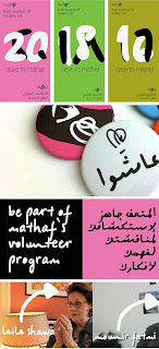
Across the campaign, the two typefaces and the two languages are used in combination to great effect. I love the overlapping Latin and Arabic numbers in the countdown ads and the bilingual applications of the handwritten face across the board.
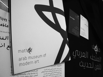
But the typography best when the corporate and handwitten typefaces are used together or—more frequently—when the former is used in conjunction with the... uh... squiggle? The squiggle can take on many forms—looking in the example above most like a Latin A and an Arabic alif (each transliterating to the other’s sound and placement in the word mathaf)—but everywhere and in every form does a great job communicating the creative chaos of artistic expression. Plus, it looks pretty cool used on it’s own and across the campaign (the business cards, in particular, rock):
For more reading about the the campaign and the museum itself, check out:
Brand New: 2011 Brand New Award Winners
Brand New: Follow-Up: Mathaf, Arab Museum of Modern Art
Islamic Arts Magazine: Mathaf - Arab Museum of Modern Art
FB


 Across the campaign, the two typefaces and the two languages are used in combination to great effect. I love the overlapping Latin and Arabic numbers in the countdown ads and the bilingual applications of the handwritten face across the board.