Thursday, January 10, 2013

Hack It To Win It!


This past weekend, a team of Slalom developers and designers—including myself, Walt Austin, Jeremy Lizza, Basil Udoudoh, and Brad Roller—took 2nd place out of 84 teams at the 2013 AT&T developer conference hackathon. We even got to present at the keynote with AT&T and Cisco's executive leadership!

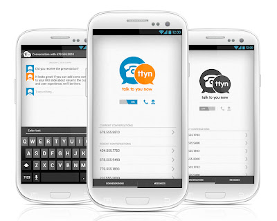
Our app, Talk To You Now, allows voice- and text-communicators to participate in the same conversation, in real time using transcription and text-to-speech technology. And we designed and developed it in 26 hours (give or take—Red Bull bends time).

Since we returned, a number of my visual design and UX colleagues have asked me about the process we employed to design and develop a complete app in such a short amount of time.

For those unfamiliar, a hackathon (or codefest) is an event in which teams of software developers and others in related fields—like graphic designers, interface designers, UX professionals, project managers, etc)—collaborate intensively to complete software development projects in extremely short amounts of time, often for prizes. In our case, we holed up in the The Palms, Las Vegas, with a few hundred peers, and were given the challenge of developing an application that utilized one of several APIs or hardware platforms presented to us (AT&T’s Call Management API, the Backberry or Windows 8 phone platforms, developing for GM’s connected car or AT&T U-verse product, etc).

The challenge began on Sunday, right around lunchtime. Abhorring the crowded ballrooms of the event, our team—consisting of three developers, a project manager, and a UX/designer (me!)—retreated back to one of our rooms and got to work. First thing, we brainstormed any and all ideas we had—some that were born that morning and some we’d been noodling on for weeks. We judged these ideas against many measures: How complex is the idea? Can it be done in 24 hours? What are the use cases? Would we use it? Is the idea a good candidate to win a niche or general category? Eight ideas got whittled down to two. Merits were compared and, after an hour, we landed on our idea.

Then we got lunch.

While we walked through the casino, we bandied around ideas for names, characterizations, use cases, and scenarios for our app. It was on that walk (‘round about the fantasy-themes slots) that the TTYN (Talk To You Now) brand was conceived as a play on the ubiquitous TTYL text message.

Back in the room, our next step was proof of concept. The developers set to confirm that basic functions we were hoping to achieve were, in fact, doable. Meanwhile, I started to script sample flows and prove the UI complexity. It was in this phase that a lot of the kinks of the basic operational flow were worked out and in which a great many phase 2 ideas were conceived. Ideas that would never make it into the app in 26 meager hours but were, nonetheless, captured in our flows for eventual development.

The flows and basic architecture proven, the development team moved out of concept testing and into application development. They set up servers on multiple cloud services to handle the voice and text sides of the call, secured access to the AT&T API we were basing our app on, and began the difficult talk of tying all these systems together. Meanwhile, I began by wireframing out the user interface. Once that was done, I moved into exploring the TTYN brand, with AT&T’s brand colors as a starting point. Explorations of iconography, typography, textures, and Android platform UI standards kept me busy until around midnight of the first night when I wrapped the first draft of the visual design.

We were twelve hours in, had proved our concept, flowed, wired, branded, and designed the app. We’d set up the servers and were busy working on the guts of the app. Knowing that UI integrations was a few hours off, I went and got a drink…

I mean, I caught some sleep.


The three developers worked through the night and about 6am, Sunday, I rejoined the team. UI development was underway and assets needed to be resized and revisions needed to be made. By 10am the developers were testing while I started working on presentation assets. The project manager, the senior developer, and I assembled the presentation, focusing on our three core use cases—the hearing imparaired, the busy executive in a meeting, and the call center employee—and tried to help the developers however we could. By 2pm, we went downstairs to rejoin the throng of hackathon attendees and to present.

We had 90 seconds to present our app. A mix of Keynote slides and live demo. And whatever we did—great concept, killer UX, awesome use cases, working demo—it was enough to get us through as one of the three finalists that presented the next morning at the AT&T Developer Summit keynote, right after AT&T Mobile’s Ralph de la Vega and right before Cisco’s John Chambers.

We were, of course, disappointed not to win first place. (We lost to an Italian guy in robotic cat ears. Hard to feel bad about that.) But we were thrilled to walk away in second—especially out of 84 teams!—and to have participated in the keynote. It was win for Slalom, for sure, but for the five of us, in particular. We work together at the office but never under such frantic conditions. And it proved that a solid, cross-discipline team (development, project management, and UX) can over-deliver in a heartbeat. Hopefully the app will find a second life as a real project and you’ll see Talk To You Now in the Android and Apple app stores, soon.

Thursday, August 18, 2011

The Visual Language of Game of Thrones

Like many folks, I was entranced by HBO’s recent series Game of Thrones. So much so, in fact, that certain house words have entered my vernacular and that I took the unprecedented step of reading the books after watching ita feat only previously accomplished by Chuck Palahniuk’s Fight Club. And, sure, the acting was great (Peter Dinklage absolutely deserves the Emmy) and the story was engrossing in all its bloody, incestuous, and betraying soap-operatic brilliance but these are things we’ve come to expect in our much lauded, current golden age of television. No, what piqued my creative interest wasn’t the narrative storytelling, per se, but rather the visual storytellingboth the art direction of the show's effects and the mindblowingly original opening credits.

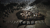
As consumers of TV pop culture, I suspect most of us aren’t aware of how much of what we see on the little screenfrom the most fantastic to the most mundaneis accomplished with the use of virtual backlot. But a fantasy series like Game of Thrones invites examination and, thankfully BlueBolt, the company behind the show’s effects, has put together a effects reel to show you just how many and much of your favorite Westerosi settings are pulled from the bowels of a computer. Expecting elaborate effects, I was still surprised how much certain cornerstone setsWinterfell, in particularare artifice. It’s definitely worth a look (though there are spoilers aplenty late in the reel):


But the more daunting creative challenge Game of Thrones faced wasn’t just how to create a convincing look and feel for Westeros (which they certainly did) but, rather, how to orient the audience in a new world with unfamiliar geographies, politics, and history. Most genre and historical features meet this challenge with the standard map-and-sonorous-voice technique whereby a map of Middle Earth or Ancient Rome or the Pondarosa is presented, showing the lay of the land while a deep, male voice evokes the setting in brief turns of ominous phrase.

Game of Thrones does away with this precedent. In its places is a complicated opening sequence that is both a work of art and a layered info graphic. Through the use of an inverted globe, mechanical geographies, and an burning solar astrolabe (armillary sphere, to be specific) the lands, specific settings, heraldry, and dynastic history of the Seven Kingdoms is communicated quickly and stylishly. And that the opening sequence changes several times over the course of the season, orienting the audience to new localeskeeps each episode’s introduction relevant to the action at hand.


You can read a full interview with with Creative Director Angus Wall of Elastic about the Game of Thrones opening credits over at Art of the Title. And I encourage anyone in fiction, film, or infographics to do soit’s a fascinating look behind the curtain of the two-year process that produced the best title sequence on television. FB

Monday, April 25, 2011

An Award-Winning Bilingual Squiggle?

I’m a sucker for good typography and Latin-Arabic crossover work—as the last several posts no doubt attest. But I’m not the only one, turns out. The folks over at Brand New recently awarded the Mathaf: Arab Museum of Modern Art the title of best comprehensive identity program and best in show.

Mathaf, Arab Museum of Modern Art (mathaf, متحف, is Arabic for museum, pronounced mat-haf) is a new modern art museum in Doha, Qatar. Its mission is to "showcase modern and contemporary art from the region, shifting existing perceptions of arts practice in the Arab world, and provide a forum for dialogue and scholarship." The award-winning branding program was handled by the Dubai office of Wolff Olins with two custom typefaces—a handwritten face fashioned by the Netherland’s Tarek Atrissi Design and a clever corporate face designed by Pascal Zoghbi from 29ArabicLetters.

The corporate typeface’s ultra thin font lends the museum a contemporary image—and one that should be familair to those versed in museum and art’s branding . But the face’s hybrid Kufi-Naskh Arabic letterforms complement their edgy lowercase Latin counterparts and, combined with some unique ligatures and clever adaptations to standard Western letter-shapes, present a unique bilingual Arabic–English typeface. For instance, I love how the Latin ligatures with horizontal letter connections create a stylistic connection between the Arabic and Latin script—A refreshing adaptation given the frequency with which Arabic typography is so frequently bent to accomodate Latin conventions and not the other way around.

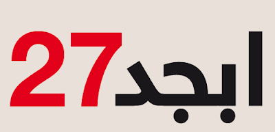
Across the campaign, the two typefaces and the two languages are used in combination to great effect. I love the overlapping Latin and Arabic numbers in the countdown ads and the bilingual applications of the handwritten face across the board.

But the typography best when the corporate and handwitten typefaces are used together or—more frequently—when the former is used in conjunction with the... uh... squiggle? The squiggle can take on many forms—looking in the example above most like a Latin A and an Arabic alif (each transliterating to the other’s sound and placement in the word mathaf)—but everywhere and in every form does a great job communicating the creative chaos of artistic expression. Plus, it looks pretty cool used on it’s own and across the campaign (the business cards, in particular, rock):


For more reading about the the campaign and the museum itself, check out:
Brand New: 2011 Brand New Award Winners
Brand New: Follow-Up: Mathaf, Arab Museum of Modern Art
Islamic Arts Magazine: Mathaf - Arab Museum of Modern Art
FB

Thursday, July 1, 2010

The جديد Neue Helvetica

I was thrilled recently to come across Nadine Chahine's article on ilovetypography.com touting her new Linotype type face, Neue Helvetica Arabic.


Nadine has already given us Arabic interpretations of Frutiger and Palatino (the later of which, developed with Hermann Zapf, won the Certificate of Excellence in Type Design from the TDC). And I say interpretations because, as Chahine notes herself, "One would think that all one has to do is to import the curves of the Latin into the Arabic script structure and the work is practically done. This is not the case."

I've tackled a few bilingual logos and the process of adapting a Latin-service typeface to suit Arabic letter shapes is more than just matching weights, curves, and the oft-tragic transplantation of serifs. Chahine describes the interpretive process, saying, "Look at what Neue Helvetica does as a typeface, how it functions, what visual message does it carry, and then see how to achieve that function and message in Arabic. It is not about how similar the curves are, but how similar the typefaces function. This is at the heart of multi-script type design .... how would you translate an iconic design into a script that defies neutrality? Is this even possible? To make things more complicated, Arabic calligraphic styles are many and some are more suited for headlines, others for text. Helvetica functions on both platforms so the Arabic needs to do so as well."


This is a tremendous addition to designers working in Arabic script. And while the face is currently only available in three weights—Light, Regular, and Bold—I'm hoping the wide variety of neue weights we've become accustomed to in Latin script follows soon in Arabic.

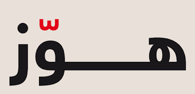
Oh, and on a purely personal note, I love that Chahine's sample images are the Arabic equivalent or lorem lpsum (ابجد هوّز). FB

Wednesday, January 13, 2010

Ink is Light, Paper is Photography, Calligraphy Becomes Choreography

Our affinity of Arabic calligraphy recently led us to the work of Julien Breton (aka Kalaam), a French artist whose light calligraphy takes the look of modern Arabic calligraphy and sets it, through time lapse photography, in front of dramatic backdrops. And while not authentic Arabic calligraphy–Breton uses an original Latin-based alphabet in a semetic style–his technique both evokes the best of modern Arabic calligraphists, such as Hassan Massoudy, Western graffiti and digital arts. And the best part, Breton's images are made without digital special effects.

According to Breton, "The principle is simple: The camera, placed on a tripod, takes a photograph in a 'Big Break.' This means that photography can last from 30 seconds to several tens of minutes depending on the brightness of the place. The same principle used by photographers to photograph the streaks of headlights of cars. During this long pause, I build calligraphy using lamps of different shapes and color, using the setting as 'a backdrop.'"

Breton's light calligraphy requires not only calligraphy skills but also a full range of body language, choreography, and hi-tech exchanges with photographers and video artists. But through patience and skill, Breton and his collaborators can turn almost any backdrop into a canvas, from beautiful landscapes and historic monuments to the sides of buildings or the bare-skinned backs of models in pose. And since early 2009, Breton has worked with Digital Slaves to develop a new process for creating real-time virtual calligraphy.

Enjoy a few samples of Julien Breton's light calligraphy below. And if you're interested in learning more, check out an interview with him about light- and virtual-calligraphy at Ziggy Nixon's blog.


See more examples at Julien Breton's website. FB