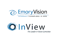
 This past February Emory Vision Center, arguably the premier Atlanta-based center for vision correction surgery, ceased to exist.
Emory Vision Correction Center was founded by faculty of Emory University School of Medicine in 1994. It quickly became synonymous with quality care, the Emory standard of excellence, and was the first facility to introduce Lasik techniques to the Southeast – performing over 40,000 such procedures as of this writing.
But Emory Vision Center is no more. There was much disappointment at Cloudjammer Studio over its departure – several of us had long planned to visit the center for corrective eye surgery. After all, it's Emory. It's top-notch. Not some classless and dodgy strip-mall Lasik practice.
Hence our surprise when we leaned that the venerable Emory Vision Center had become InView ("EnView", as pronounced in their barely intelligible radio announcement).
Emory Vision was always an independent health care provider – unrelated to Emory University or its leading health care centers – licensing the Emory name for the past 10 years. So it makes since, in light of the quality of the name change, that the decision must have been made by an accountant, not a marketing consultant.
Keith Thompson, M.D., co-founder of Emory Vision, now InView, says "the new name more accurately reflects the center's distinct focus on achieving optimal vision for each patient; its unmatched record of expertise; outcomes and technological innovation in vision correction; and the superior care provided by some of the industry's leading clinical experts, both now and in the future.This new identity better defines our future plans to expand services and offer more options to patients as new technologies and treatments are developed."
Perhaps.
But our interest is not in the marketing speak of brand management, but in the cost of brand disposal. Any company that changes its name must contest with the cost/benefit equation of education and communication: How long will it take and how much will it cost to educate consumers about the change? What communicable brand value will be lost or gained in the process?
Emory Vision center touted one of the most respected names in Atlanta medical care. Emory's School of Medicine and its related hospitals, research facilities, and health centers are both admired and applauded throughout the Southeast. Consumers – ourselves included – are willing to spend the extra money to garner Emory's level of care. With their new name InView steps down to the level of the strip-mall Lasik practitioner. The name has no particular meaning in a crowded sea of competitors and dilutes itself by becoming ordinary. It's unremarkable and impossible to remember.
But if the painful name-change weren't bad enough, there is the new logo. While Emory Vision's former logo mark may have been uninspiring, the new InView logo mark is downright inappropriate. The combination of the bold gray circle and the erratic, rough-edged surrounding swish are more reminiscent of astigmatism than clear sight. It visually resembles the Lasik-severed cornea sliced open. Poorly!
At least they kept the colors and fonts...
The Sincerest Form of Flattery
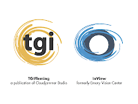
But there is more to InView's new logo mark than just their poor-sighted symbolism. Indeed, what initially interested us was the similarity the logo bore to Cloudjammer's TGIFleming logo (see the comparison).
Cloudjammer co-owner Fleming Patterson's side project, TGIFleming.com, is an events calendar oriented toward midtown Atlanta nightlife with over fifteen hundred unique visitors a month, several hundred email subscribers, and almost two years of precedent. The TGIFleming logo's use of the graphic swish was long-ago selected to describe both the energetic nature of nightlifestyles and for it's multi-purpose applications (the easy-to-apply style originally had many applications of the TGIFleming.com website).
In addition to InView's misapplied and inappropriate use the swish (my eyes cringe every time I see it in a medical context), two things strike us about the similarity between it and the TGIFleming logo – specifically the graphic swish they share:
- The use of the exact same designer swish. Be it orange or blue, it is EXACTLY the same (see the comparison).
- The designer swish is a standard Adobe Illustrator brush style. If you have Illustrator, give it a try – you too can remake the InView logo in less than 2 minutes!
This is especially troubling when one considers the price of logo design and development: How much did InView pay for this off-the-shelf logo mark? $5,000? $10,000? More?
Too much. That is certain.
Does TGIFleming suffer from this same stigma? You tell me – does it hurt a small non-profit events calendar to be reminiscent of an Emory-pedigree institution? Cheap logo or not?
Not at all. We're flattered. fb

No comments:
Post a Comment